Car Cues
CarCues is a digital companion that bridges the car knowledge gap with age-inclusive design and simplified technical education.
Context
The rise in automotive tech brings complex features and jargon that many users struggle to understand. This knowledge gap can lead to uncertainty and poor decision-making when choosing a car.
My Role
As the UX/UI Designer for this concept project, I led the full design process from research and persona creation to wireframing and visual design. I identified key user pain points like technical jargon and decision fatigue, then designed intuitive, age-inclusive interfaces that simplify car information and support confident decision-making
01 Identifying The Issues
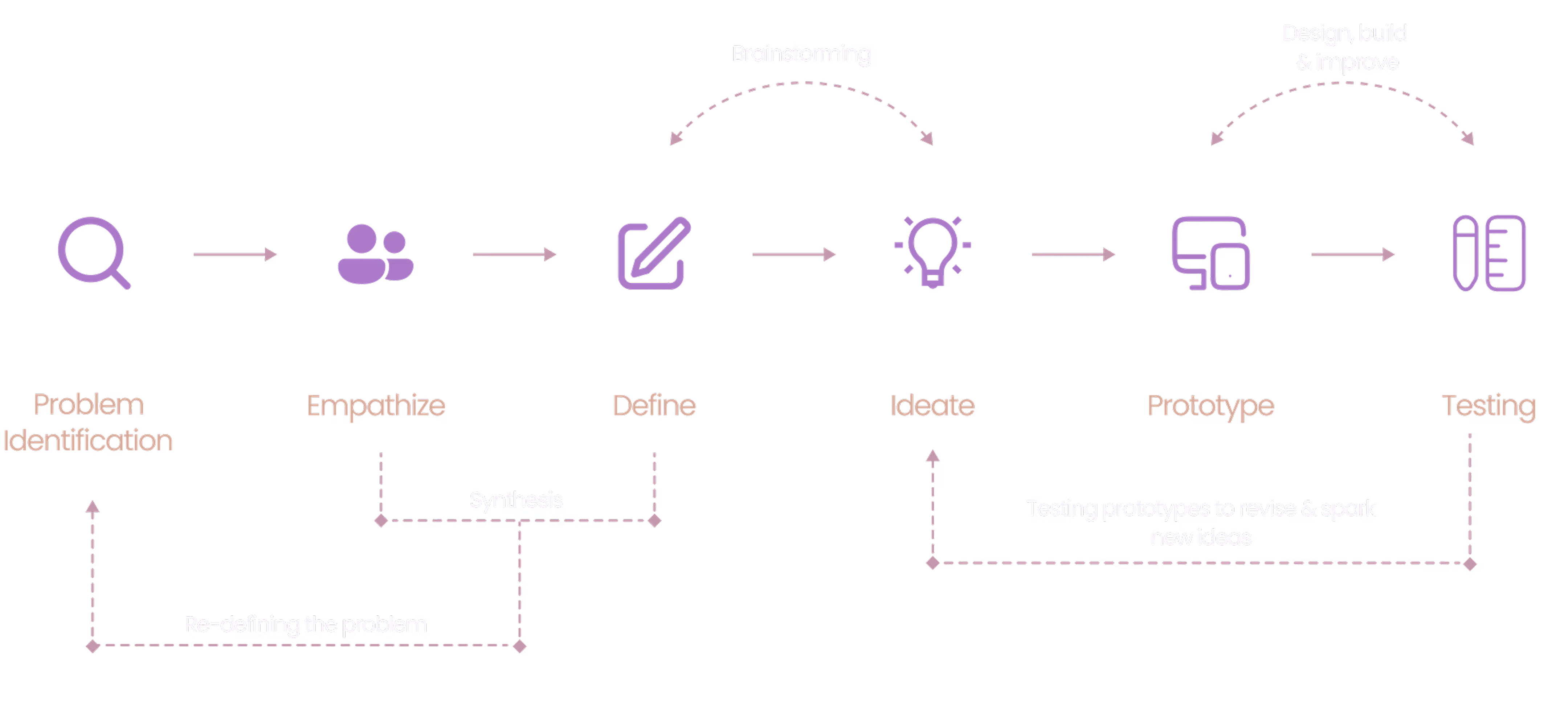
Design Process
The CarCues project followed a user-centered, iterative design process starting from identifying the knowledge gap in car buying, empathizing with users, and defining key pain points. Through ideation, prototyping, and testing, I designed an inclusive and intuitive solution that simplifies technical car information for all age groups.
Journey Mapping
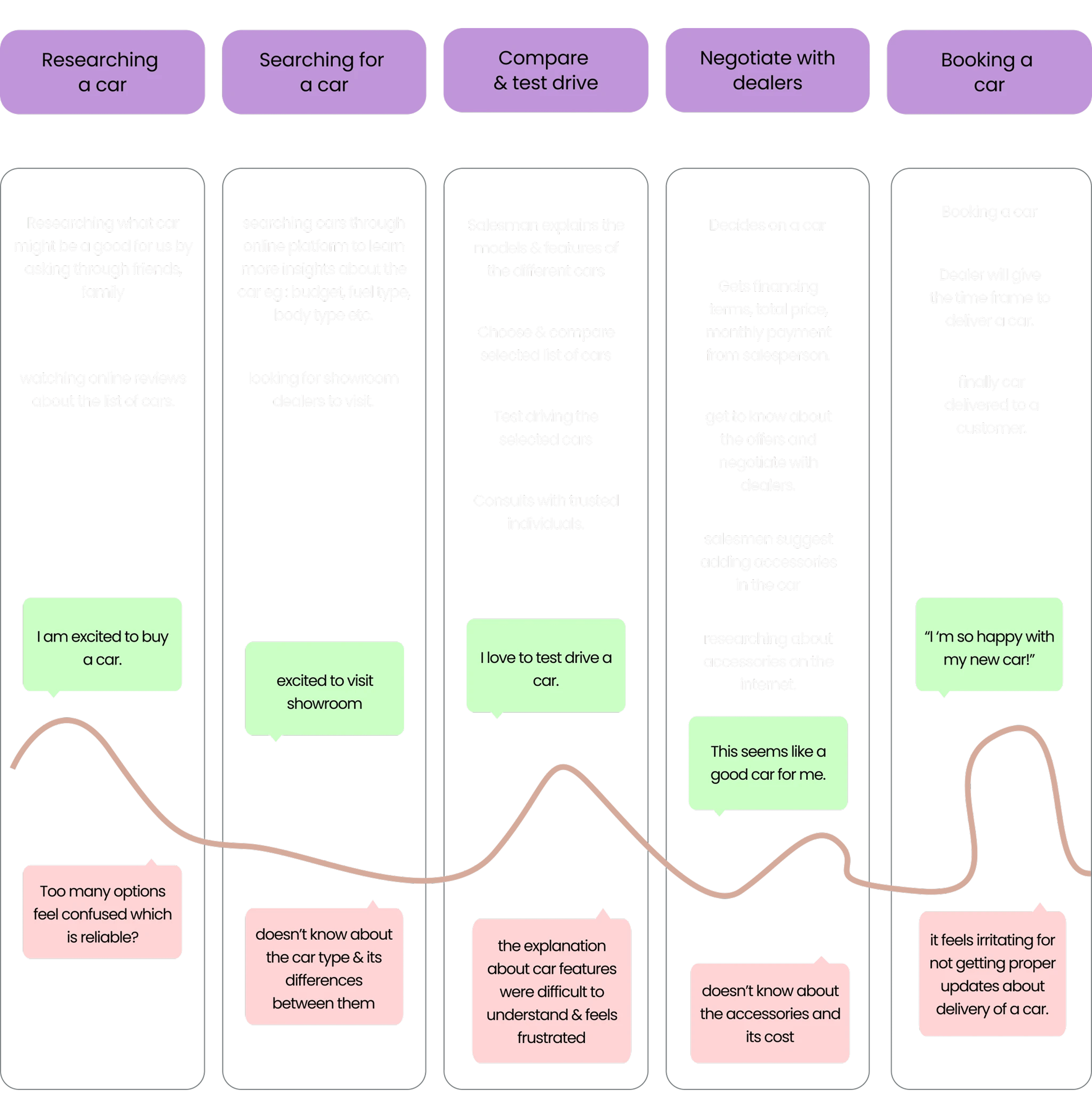
The journey map visualizes the full car buying process from research to booking, highlighting user emotions, actions, and pain points. It revealed common struggles like too many choices, confusing technical terms, and poor communication from dealers. These insights guided design decisions to simplify information, clarify car features, and support users with timely updates and intuitive guidance.
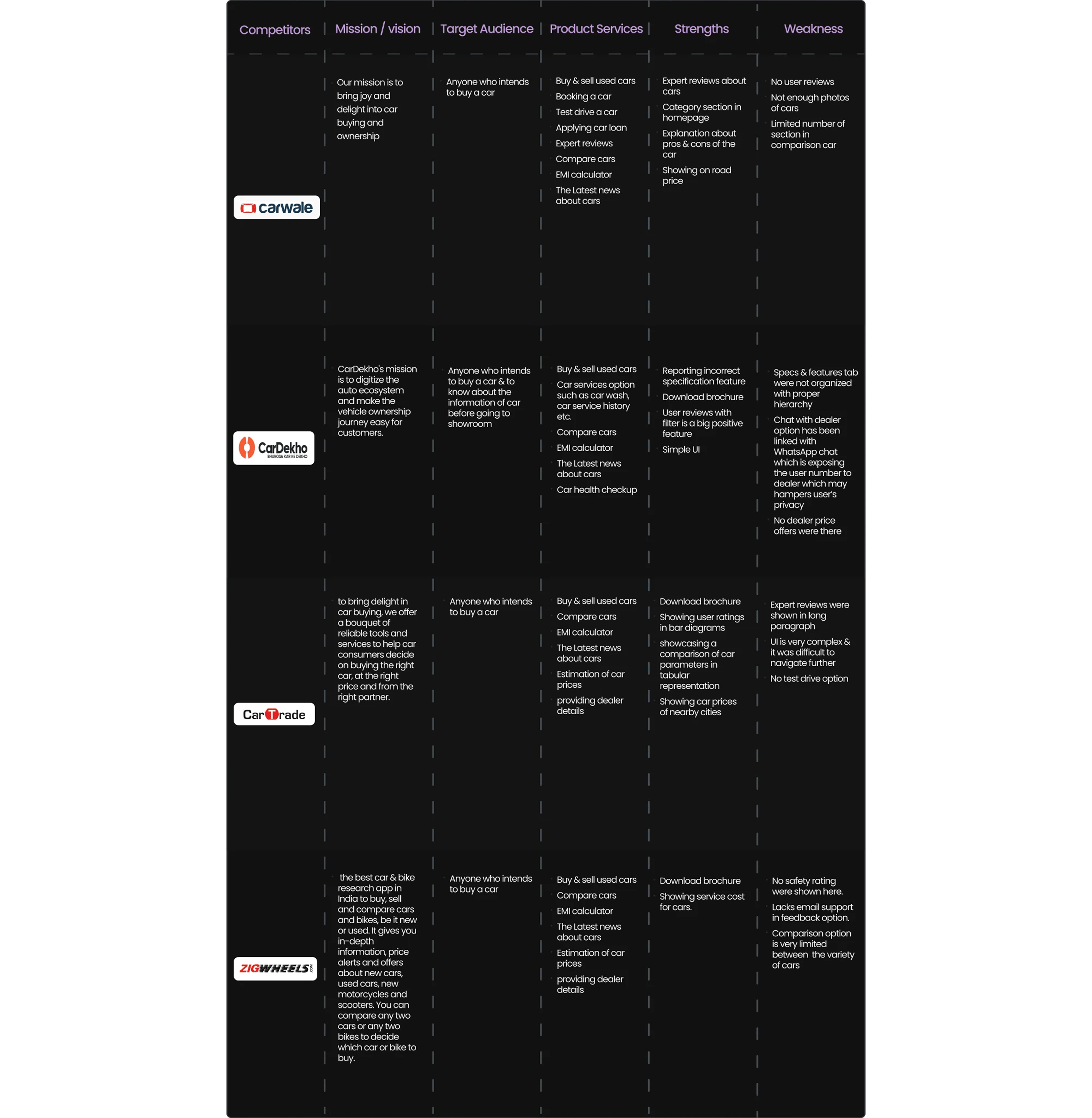
Competitive Analysis
To gain a deeper understanding of the market landscape, I analyzed various car buying and information platforms. This competitive analysis helped uncover their strategies, UX patterns, and feature gaps. The findings directly influenced the design of CarCues, allowing me to craft a more user- focused and differentiated experience.
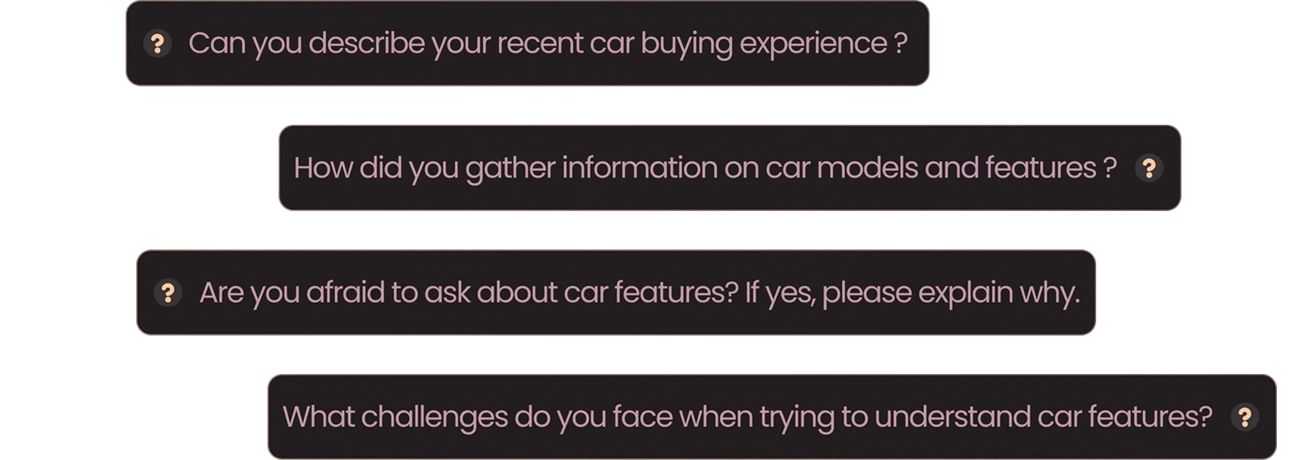
User Interview
I conducted phone interviews with 7 ( seven) participants of different age groups to identify usability challenges in the car-buying process. The findings highlighted key pain points, decision-making hurdles, and information gaps, which informed the design of intuitive UI solutions to enhance user experience and streamline car selection.
User Persona
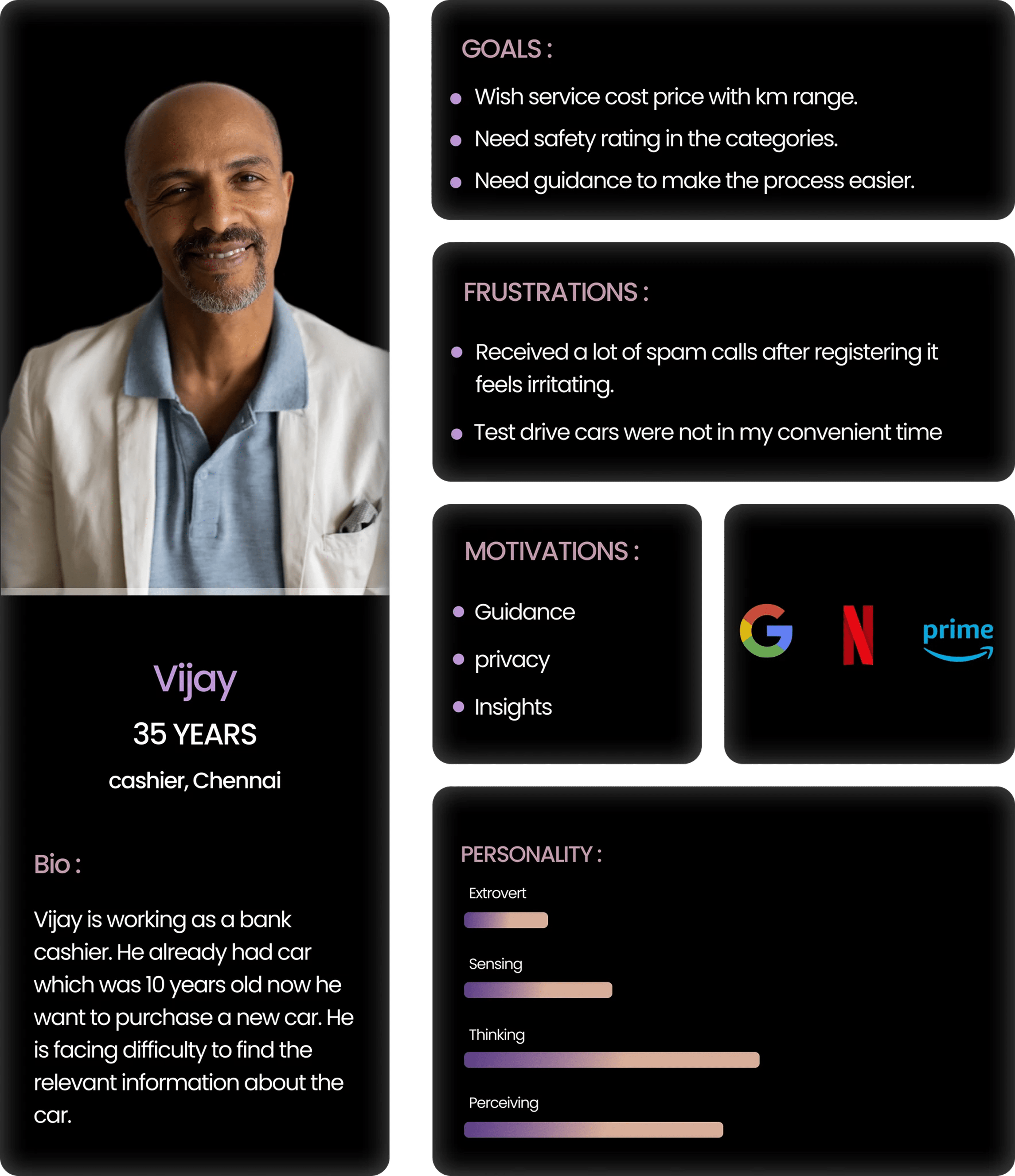
To ensure an inclusive and well-rounded understanding of user needs, I conducted interviews across two key age groups: 25 to 35 and 40 to 50 years old. The participants included both educated and partially educated individuals with varying levels of car knowledge. This diverse approach helped uncover a wide range of pain points from difficulty understanding technical specifications to a lack of trust in available information, allowing me to design more accessible and age-inclusive user experiences.
Empathy Mapping
The empathy map helped me uncover key user struggles confusion over car specs, hesitation to ask questions, and frustration with vague online info. Users often rely on friends or YouTube but still feel overwhelmed.
These insights guided me to design a simpler, more supportive experience that builds clarity and confidence.
02 Ideation
Brainstorming
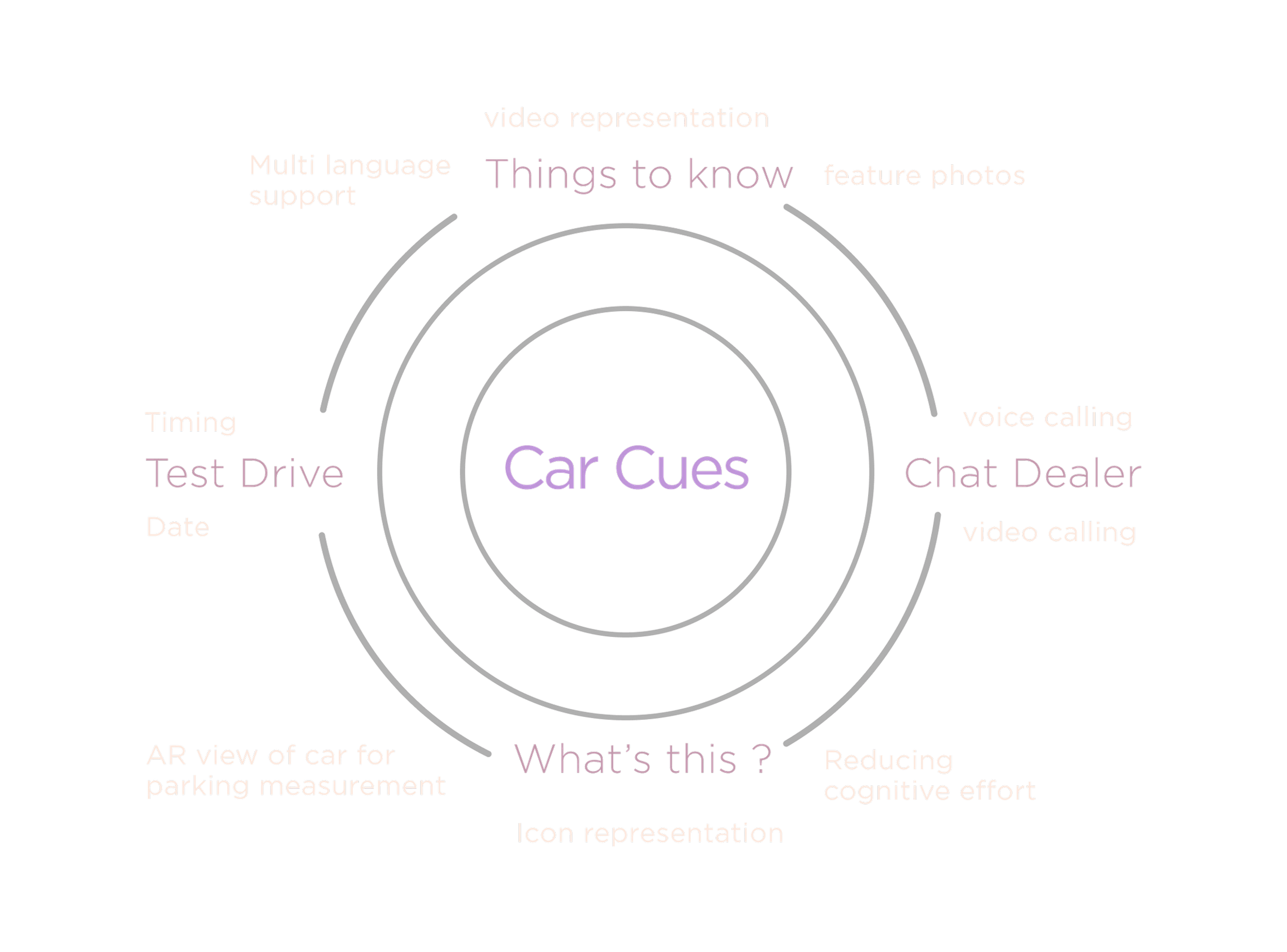
Using the "How Might We" approach, I translated user pain points into actionable ideas by mapping them into clear feature categories. I focused on simplifying complex information, making dealer communication more accessible, and reducing user effort through intuitive visuals and assistive tech. This structured ideation helped align solutions closely with real user needs.
Information Architecture
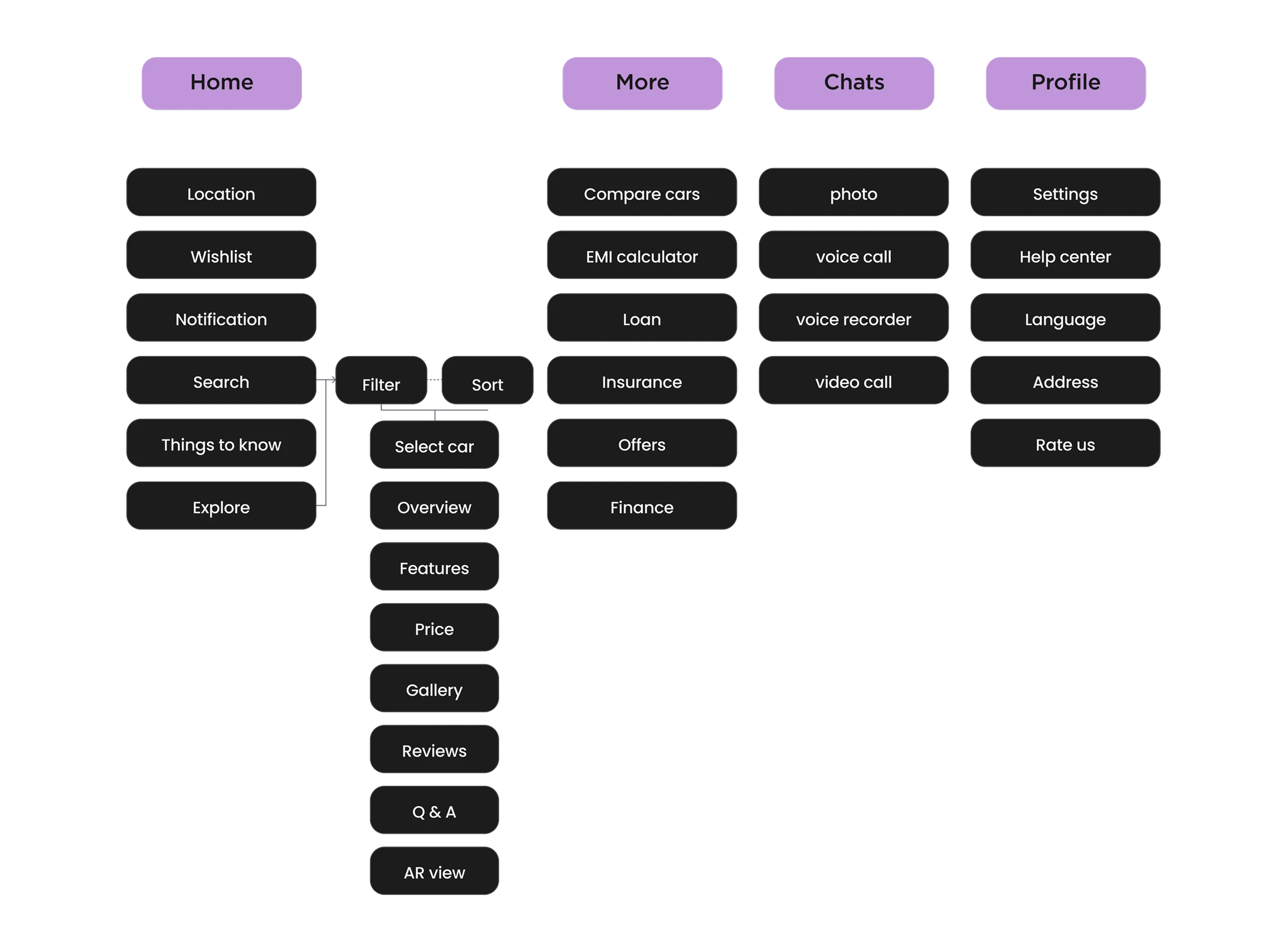
I designed a clear information architecture based on user needs, grouping features into Home, More, Chats, and Profile. This structure helps users easily explore cars, compare options, and access support with minimal effort.
Wireframes
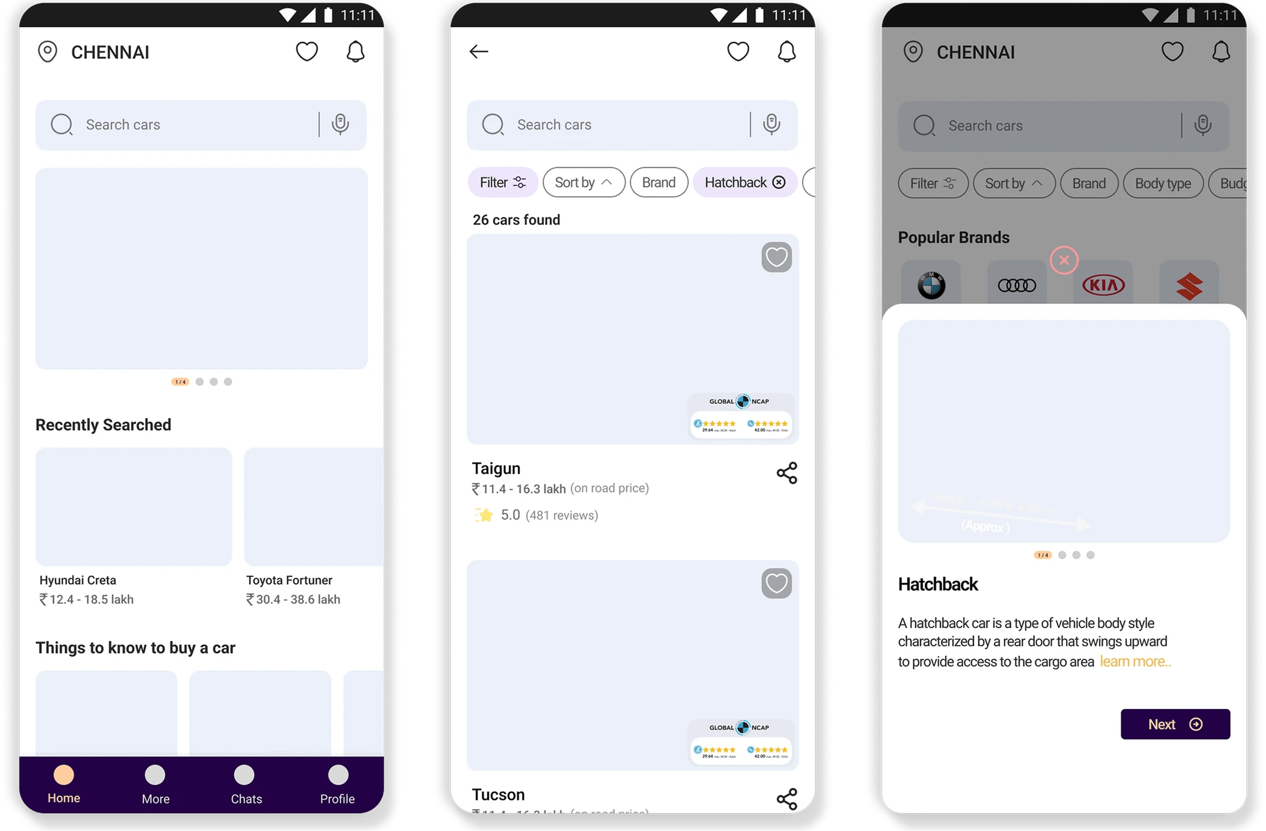
After defining the information architecture, I mapped out the user flow to understand the complete journey and interaction points. Based on that, I designed sample low-fidelity wireframes to visualize key screens, ensuring a smooth and intuitive experience aligned with user needs.
03 Visual styles
Typeface
Roboto
Regular
Medium
Bold
Grid System
Column : 4
Gutter : 12
Margin : 16
Colors
230245
614281
F4EFFD
EAF0F9
FFCB9C
272727
656A72
04 From Insight to Designs
Sign Up
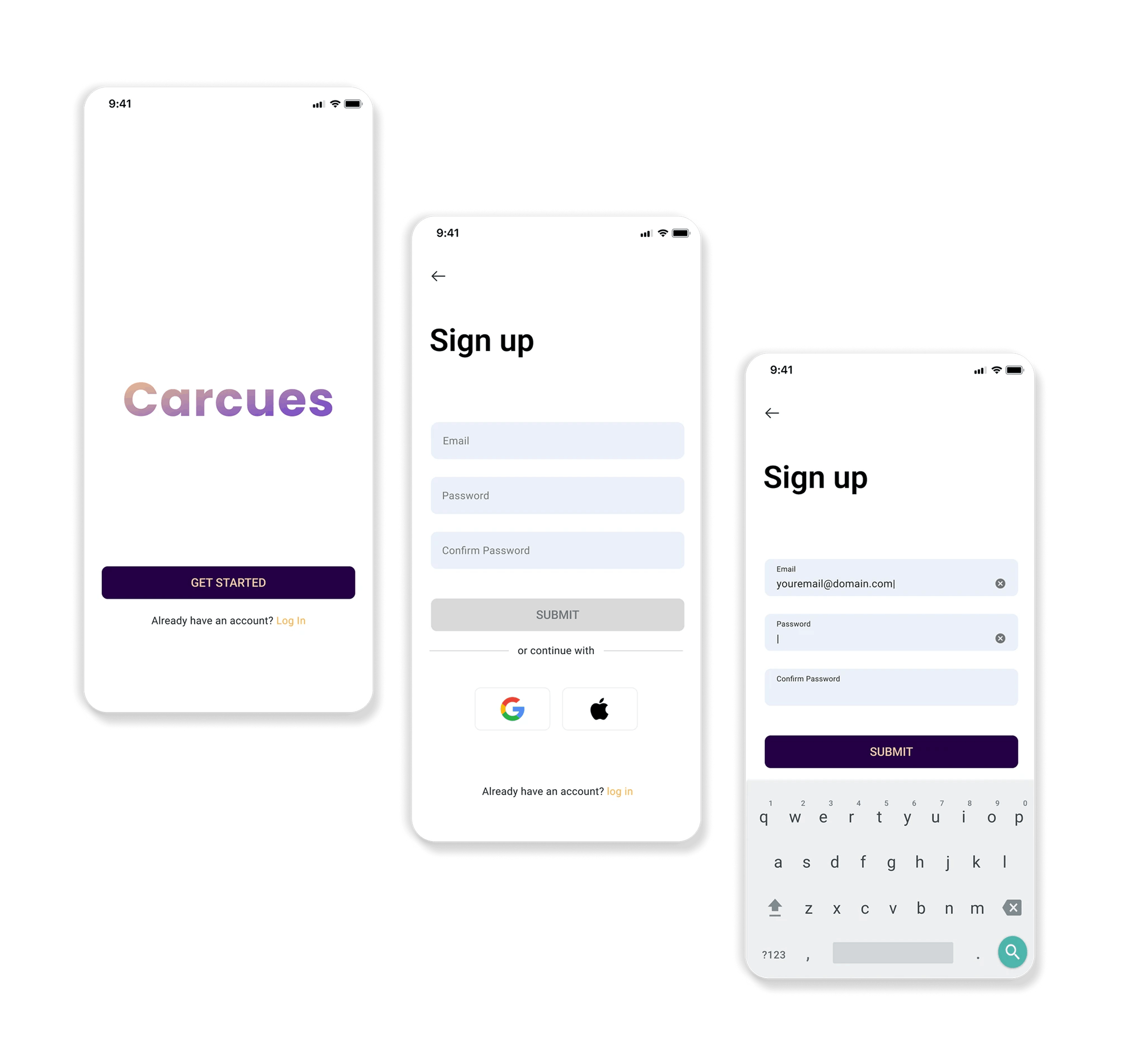
When designing the sign-up screen, I imagined Vijay a user unsure about digital platforms, hesitant to ask questions, and easily overwhelmed by complexity. So I focused on making his first step “feels simple and reassuring”. With clean inputs, minimal distractions, and easy login alternatives, the screen is designed to guide users effortlessly. It sets the tone for a platform that understands their needs from the very beginning.
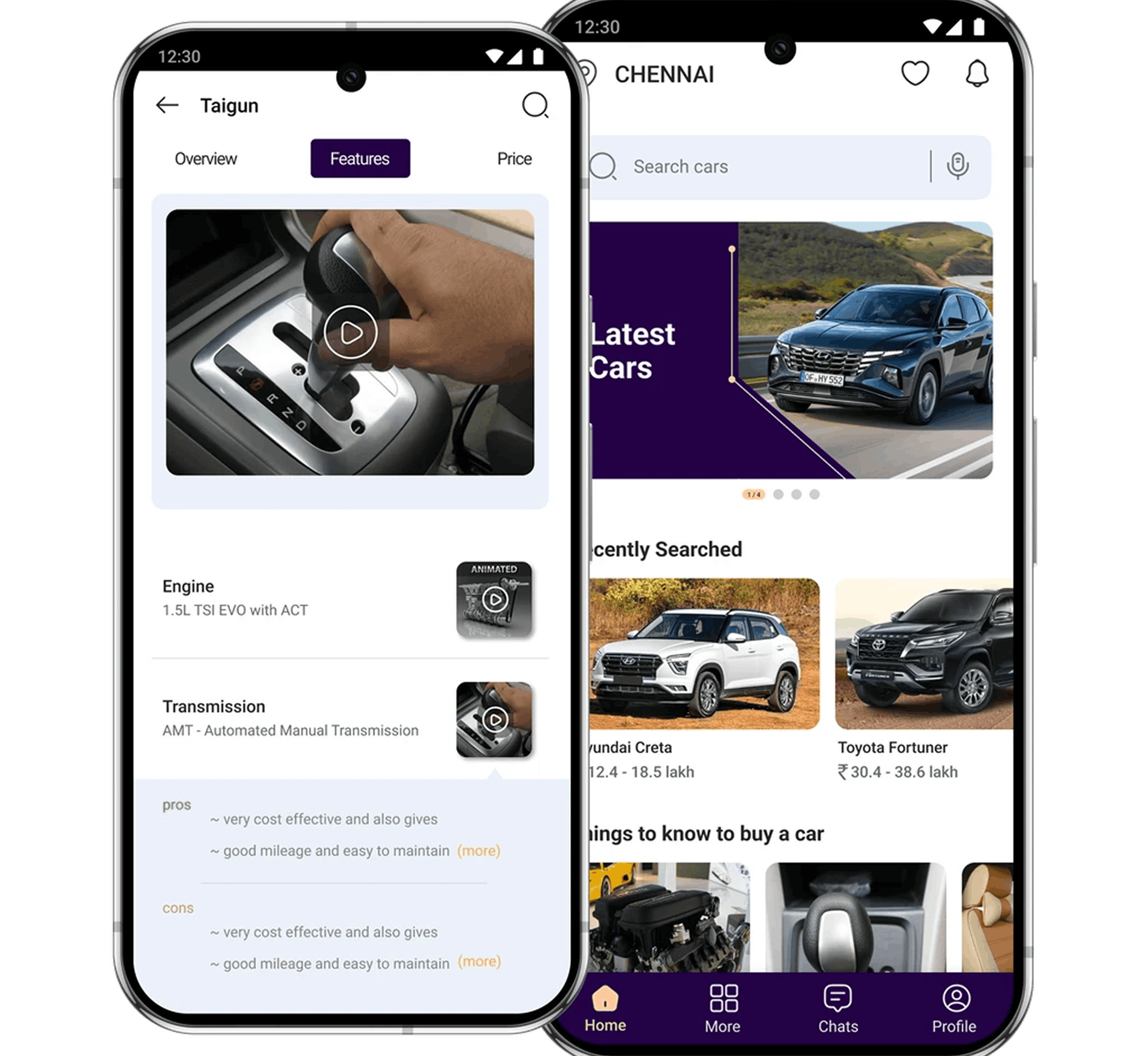
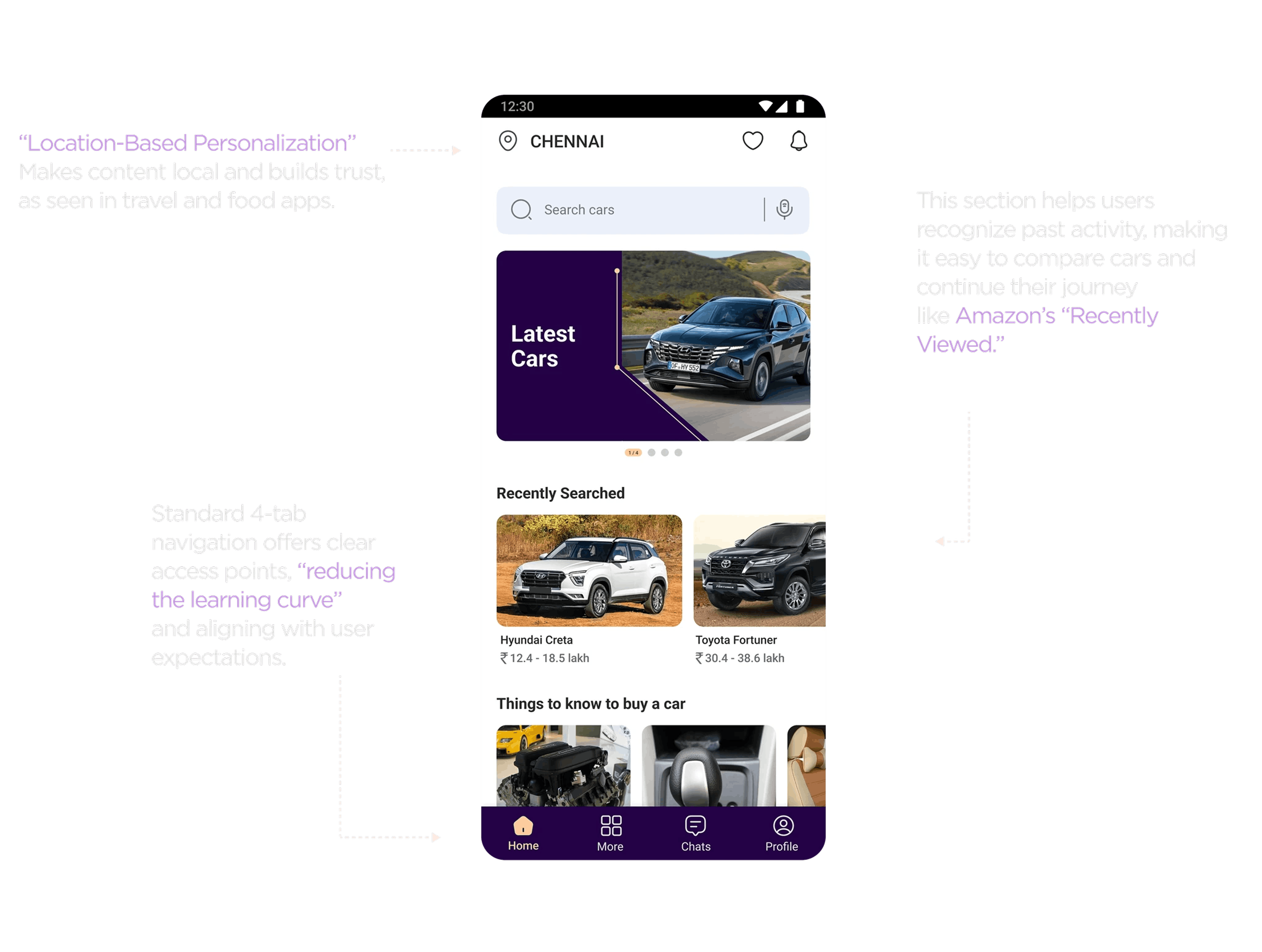
Home
The home screen was crafted to give users a quick overview of the latest cars, their recent searches, and essential learning materials.
Things To Know
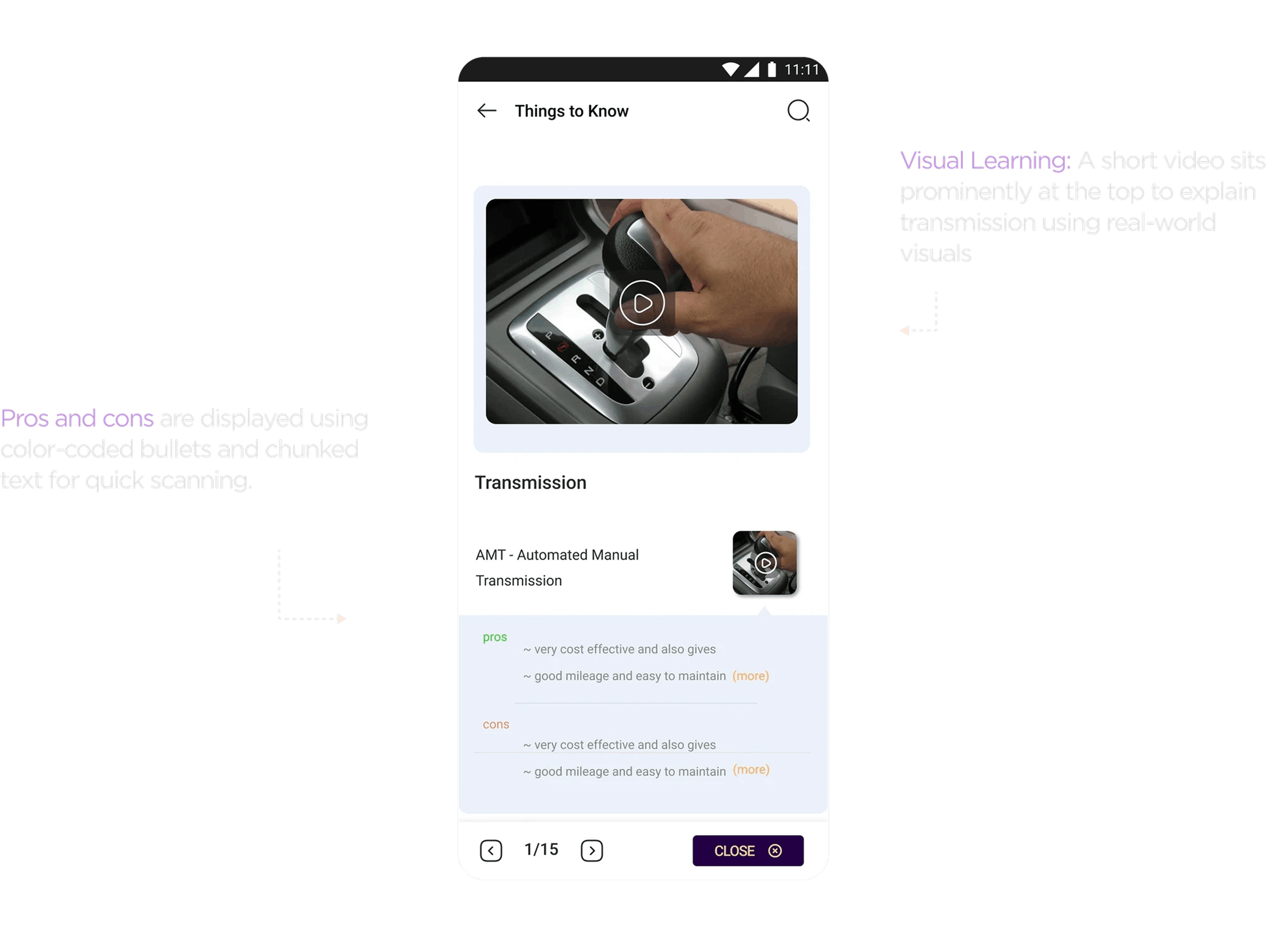
Research showed that first-time buyers often feel overwhelmed by car jargon, so I introduced a “Things to Know” section that simplifies key concepts through bite-sized, visual content. Following Jakob’s Law, I used familiar patterns from fitness apps, which aligned with user behavior observed during research.
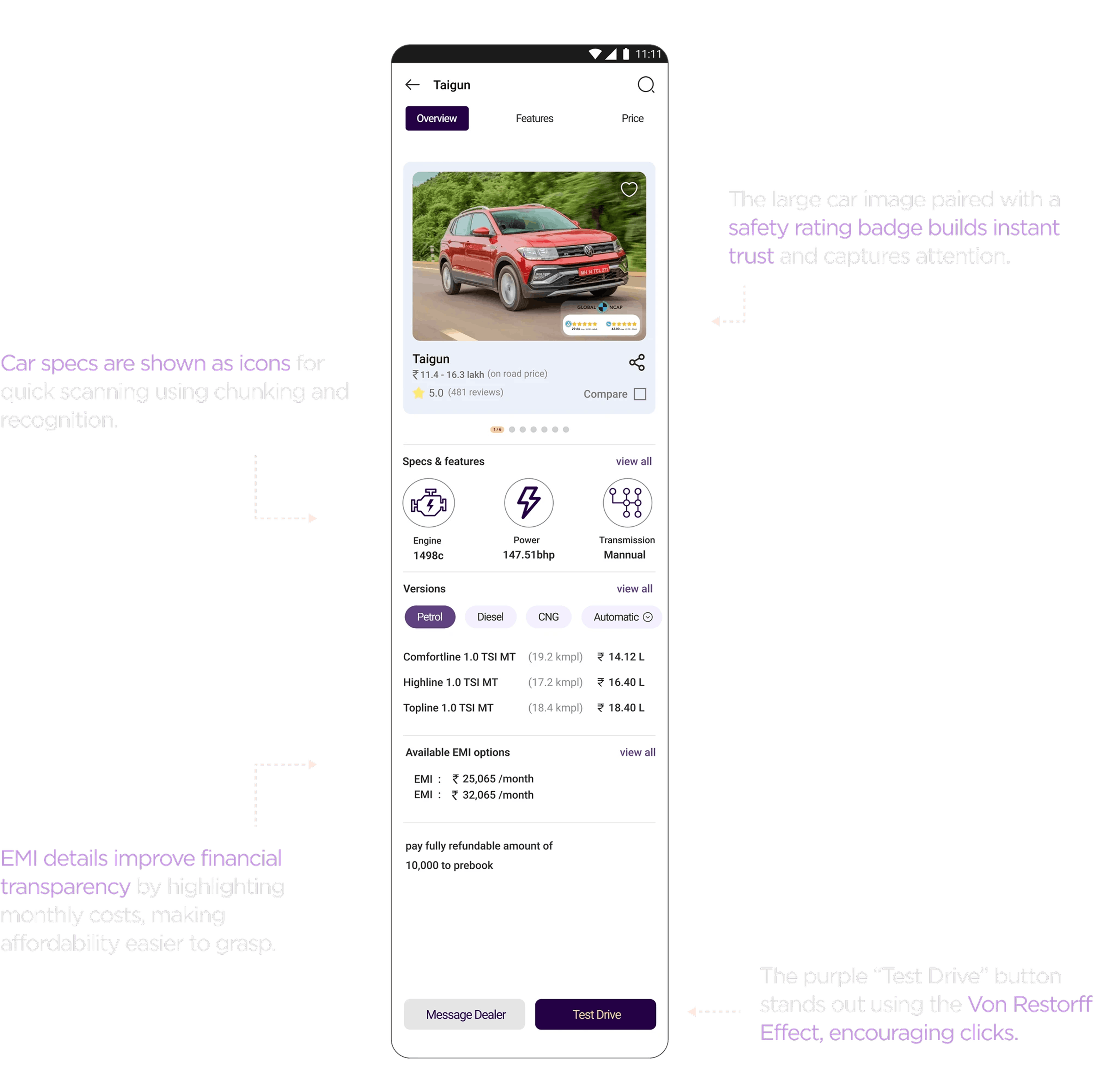
Overview
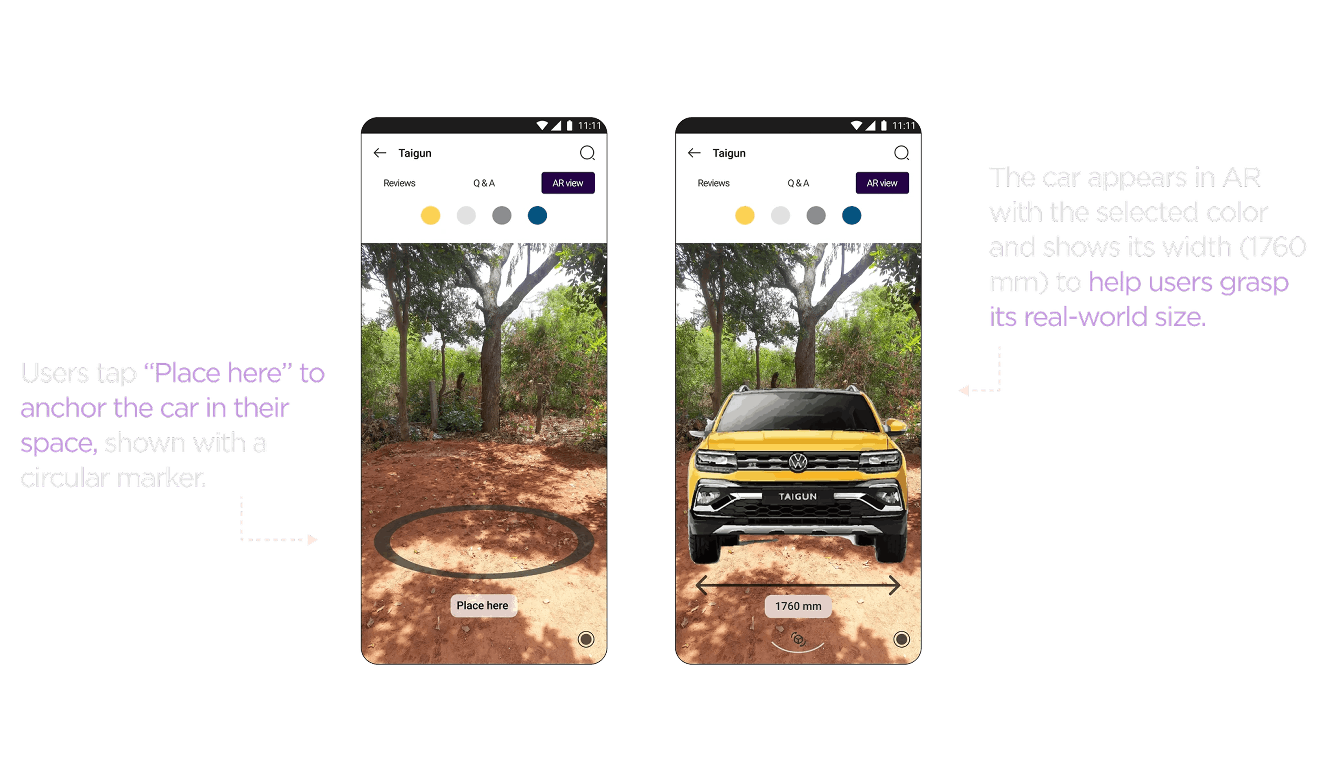
This screen is designed to provide users with a clear, engaging summary of a car model, supporting informed decision-making with minimal effort.
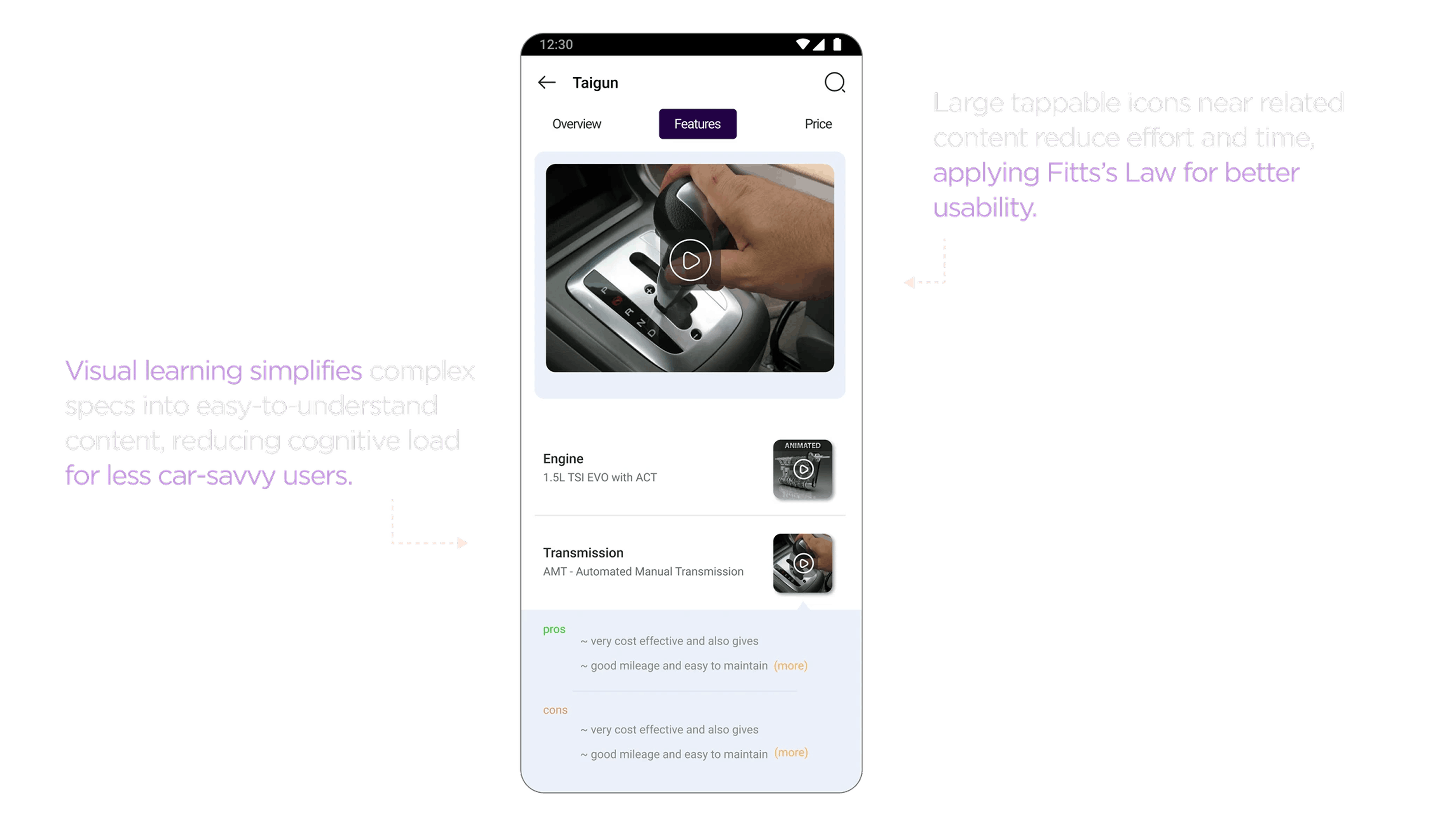
Features
this screen is designed with efficiency, clarity, and ease of use in mind optimizing for quick decisions, especially on mobile, where time, space, and attention are limited.
Reviews
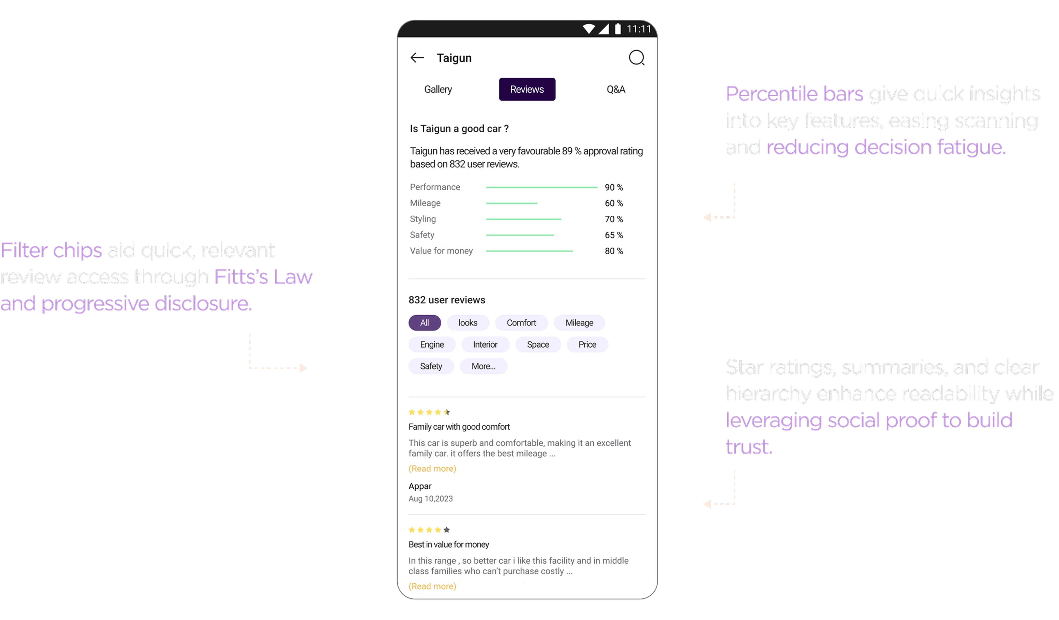
This Reviews screen in the CarCues app is designed to help users quickly evaluate a car’s reputation through data-backed insights and community opinions, enhancing decision confidence.