
Disney+Hotstar
Disney+Hotstar
Disney+ Hotstar is a streaming platform featuring movies, TV shows, live sports, and exclusive content from Disney, Marvel, Star, and more.
Disney+ Hotstar is a streaming platform featuring movies, TV shows, live sports, and exclusive content from Disney, Marvel, Star, and more.
Context
Context
Through user research, I identified key usability issues in the Disney+ Hotstar app, including complex navigation, inconsistent visual hierarchy, inefficient content discovery, and accessibility gaps, all of which impacted user engagement.
Through user research, I identified key usability issues in the Disney+ Hotstar app, including complex navigation, inconsistent visual hierarchy, inefficient content discovery, and accessibility gaps, all of which impacted user engagement.
My Role
My Role
As a UX designer, I conducted in-depth research to identify usability challenges in the Disney+ Hotstar app. By analyzing user pain points, gathering insights, and testing solutions, I proposed and designed enhancements that improved navigation, accessibility, and overall user experience. This case study highlights my problem-solving approach and ability to create intuitive, user-friendly features that elevate streaming experiences.
As a UX designer, I conducted in-depth research to identify usability challenges in the Disney+ Hotstar app. By analyzing user pain points, gathering insights, and testing solutions, I proposed and designed enhancements that improved navigation, accessibility, and overall user experience. This case study highlights my problem-solving approach and ability to create intuitive, user-friendly features that elevate streaming experiences.
01
01
Identifying The Issues
Identifying The Issues
Feature comparison
Feature comparison

As part of my quantitative research,
I analyzed key streaming features across Netflix, Prime Video, and Hotstar to identify usability gaps. While Netflix and Prime Video offer essential features, Hotstar lacks several, including season downloads, multiple profiles, and playback controls.
These insights inform my design recommendations to make Hotstar more competitive and user-friendly.
As part of my quantitative research, I analyzed key streaming features across Netflix, Prime Video, and Hotstar to identify usability gaps. While Netflix and Prime Video offer essential features, Hotstar lacks several, including season downloads, multiple profiles, and playback controls.
These insights inform my design recommendations to make Hotstar more competitive and user-friendly.
As part of my quantitative research,I analyzed key streaming features across Netflix, Prime Video, and Hotstar to identify usability gaps. While Netflix and Prime Video offer essential features, Hotstar lacks several, including season downloads, multiple profiles, and playback controls.
These insights inform my design recommendations to make Hotstar more competitive and user-friendly.
User Persona
User Persona
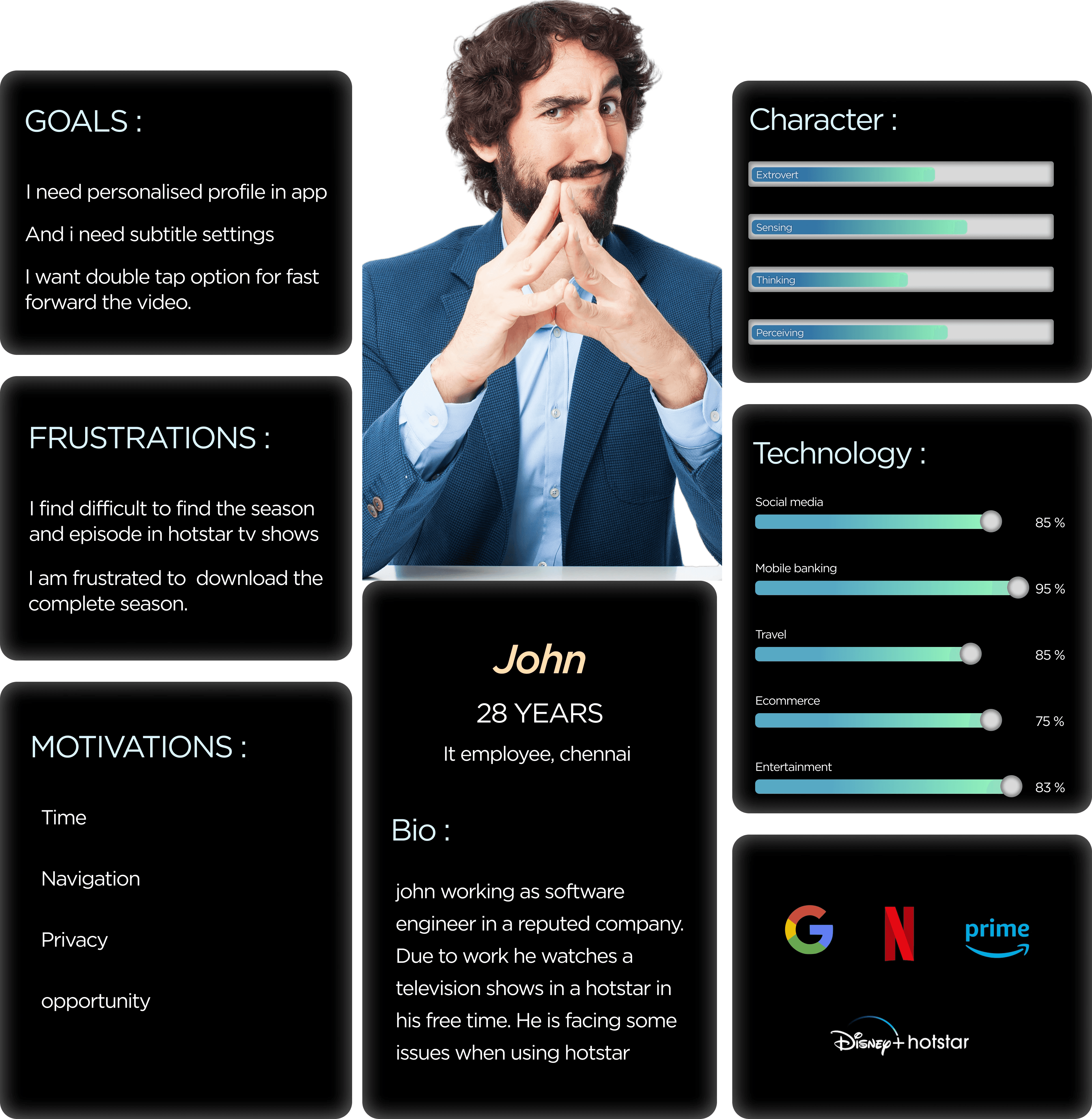
From user interviews, I created this persona to identify key pain points. The typical streaming user, a tech-savvy professional in their late 20s, values efficiency, navigation, and privacy but struggles with finding episodes, downloading seasons, and missing key features like profiles and playback controls. These insights guide my design recommendations to improve Hotstar’s user experience.
Empathy Mapping
Empathy Mapping
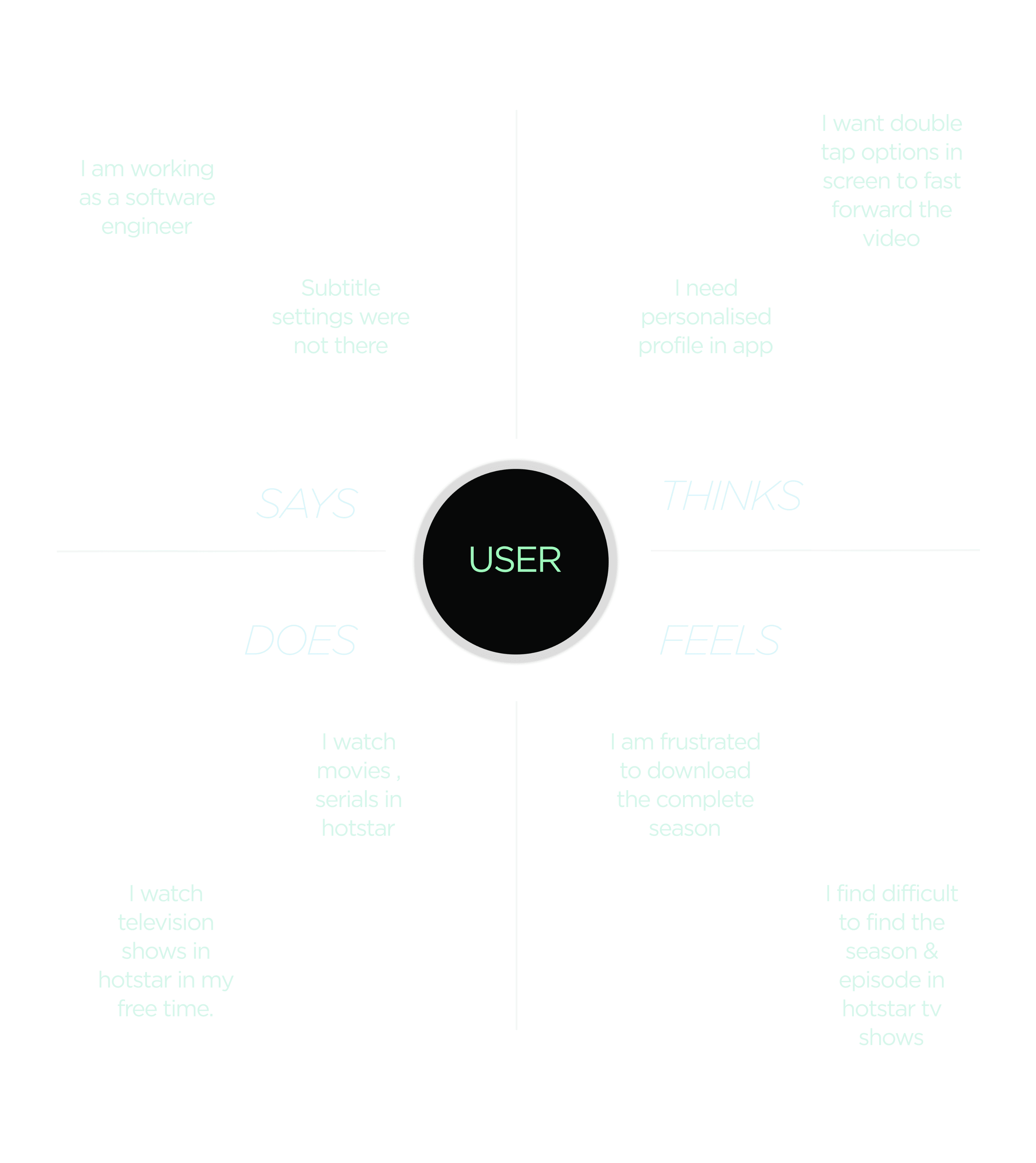
After user interviews, I mapped user frustrations and needs. Users struggle with navigation, episode discovery, and missing features like profiles and playback controls, leading to frustration. They seek a faster, smoother viewing experience, shaping my design recommendations to enhance Hotstar’s usability.
After user interviews, I mapped user frustrations and needs. Users struggle with navigation, episode discovery, and missing features like profiles and playback controls, leading to frustration. They seek a faster, smoother viewing experience, shaping my design recommendations to enhance Hotstar’s usability.
02
02
Ideation
Ideation
Feature Prioritization
Feature Prioritization
Based on the user insights and HMW questions, I brainstormed potential solutions to address the key pain points. The focus was on enhancing discoverability, playback control, personalization, and navigation. I used techniques like sketching, and mind mapping to explore multiple directions quickly.
To move forward strategically, I applied the MoSCoW method to prioritize features based on user needs, feasibility, and business impact:
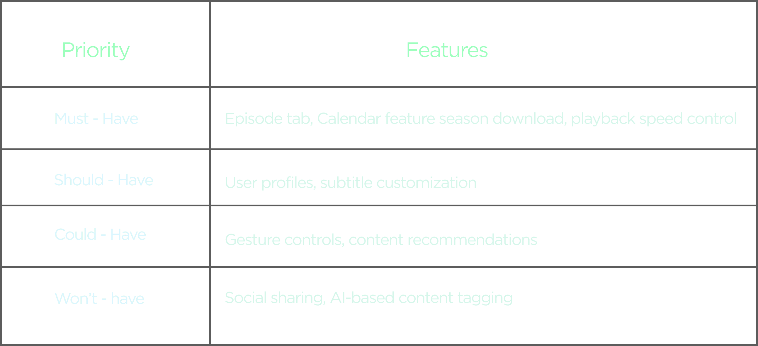
This helped focus the redesign on high-impact, feasible features to enhance Disney+ Hotstar’s user experience.
This helped focus the redesign on high-impact, feasible features to enhance Disney+ Hotstar’s user experience.
03
03
From Insight to Impact: The Hotstar Redesign
From Insight to Impact: The Hotstar Redesign
Old Home Screen
Old Home Screen
The hamburger menu led to a generic navigation flow, hiding key user-specific features and reducing quick access to personalized content, making the experience feel impersonal.
The hamburger menu led to a generic navigation flow, hiding key user-specific features and reducing quick access to personalized content, making the experience feel impersonal.
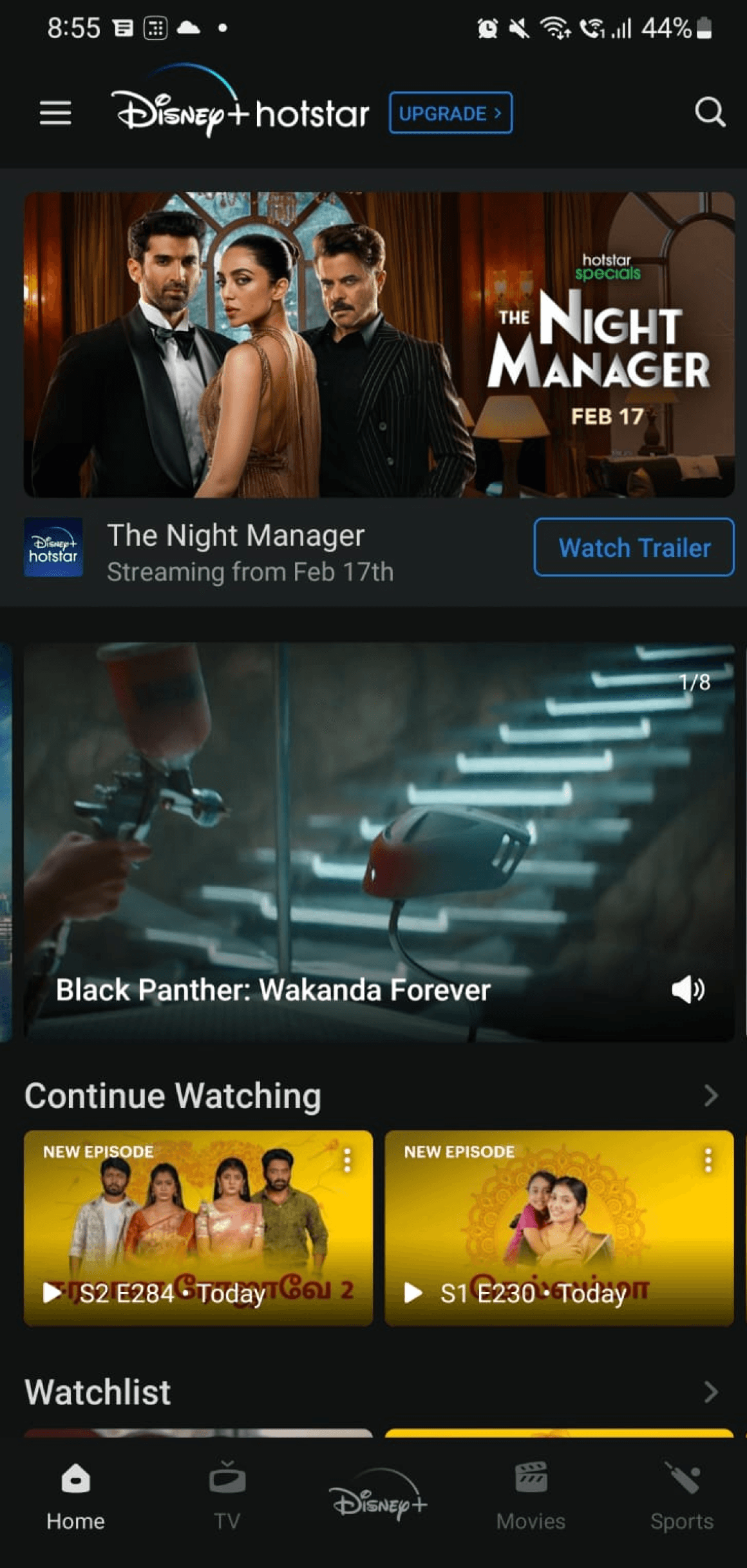
Without a personalized “Continue Watching” section, users struggled to resume content easily. It disrupted continuity and missed the opportunity for a more engaging, tailored experience.
Without a personalized “Continue Watching” section, users struggled to resume content easily. It disrupted continuity and missed the opportunity for a more engaging, tailored experience.
New Home Screen
New Home Screen

Redesigned the home screen with a stronger focus on personalization and intuitive navigation, introducing features like “Continue Watching,” a dedicated watchlist, and a clearly segmented content layout to improve content discovery. The hamburger menu was replaced with a profile icon to align with modern UX patterns, enhancing clarity, reducing cognitive load, and providing quicker access to user-specific settings.
Redesigned the home screen with a stronger focus on personalization and intuitive navigation, introducing features like “Continue Watching,” a dedicated watchlist, and a clearly segmented content layout to improve content discovery. The hamburger menu was replaced with a profile icon to align with modern UX patterns, enhancing clarity, reducing cognitive load, and providing quicker access to user-specific settings.
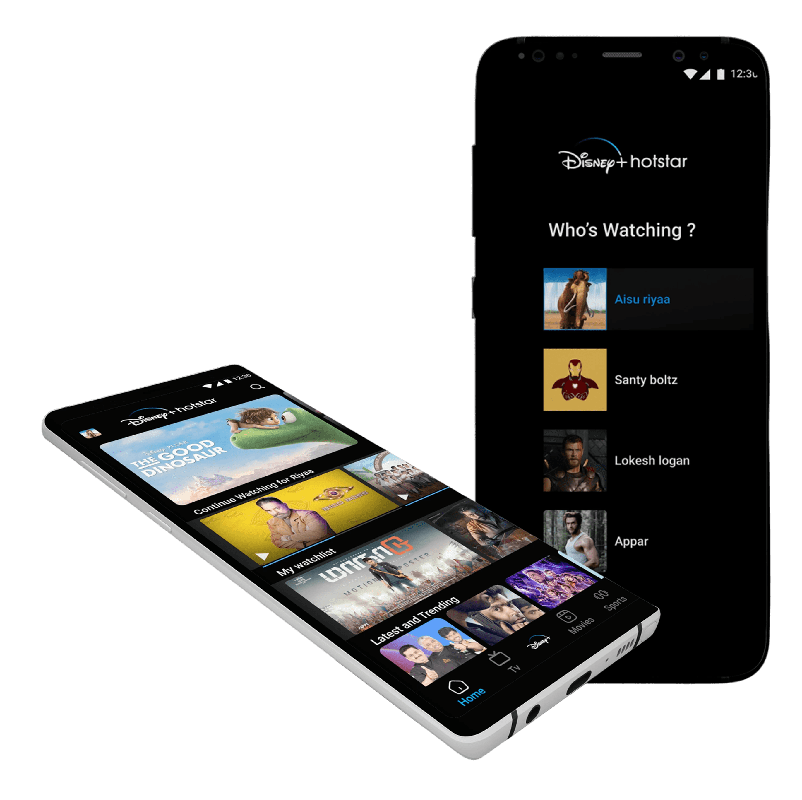
Old Menu Screen
Old Menu Screen
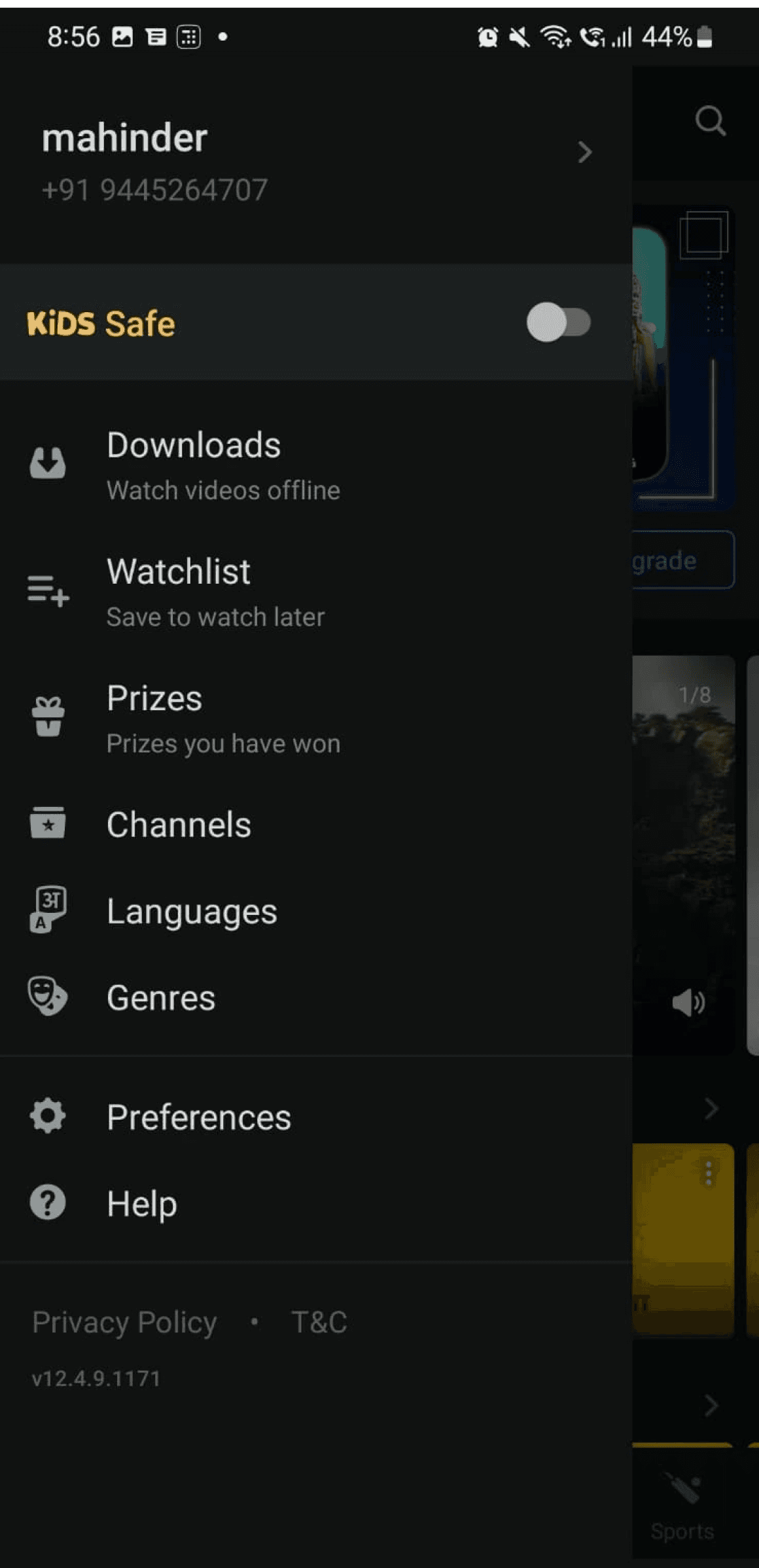
The absence of a “clear profile switcher” impacts personalization, disrupts user flow, and makes shared accounts difficult to navigate, leading to a less tailored and disconnected viewing experience.
The absence of a “clear profile switcher” impacts personalization, disrupts user flow, and makes shared accounts difficult to navigate, leading to a less tailored and disconnected viewing experience.
New Menu Screen
New Menu Screen
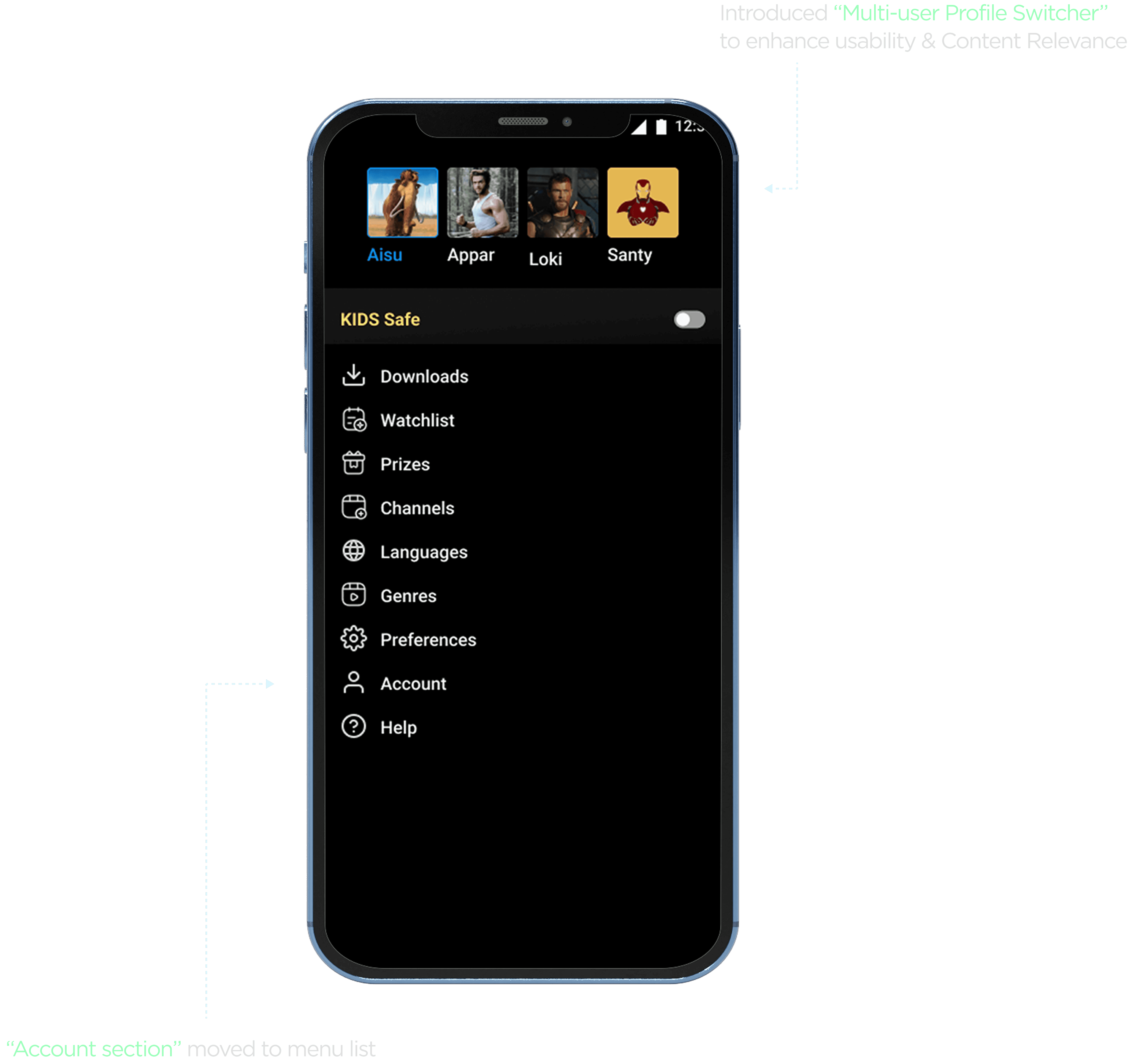
The addition of a multi-profile switcher at the top enhances user personalization and streamlines content access. It allows individuals in shared accounts to quickly switch between profiles, improving user ownership, continuity, and delivering more accurate, tailored recommendations.
The addition of a multi-profile switcher at the top enhances user personalization and streamlines content access. It allows individuals in shared accounts to quickly switch between profiles, improving user ownership, continuity, and delivering more accurate, tailored recommendations.
Old Overview Screen
Old Overview Screen
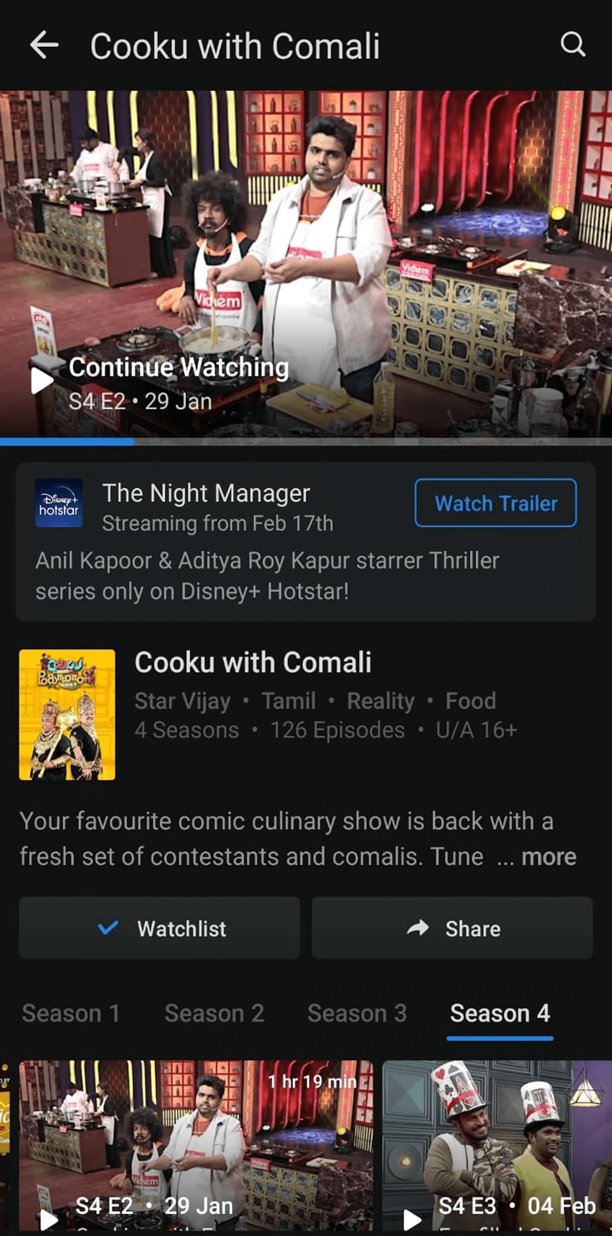
Missed opportunity to offer flexible download and viewing options as the “lack of episode-level control” and calendar limits user autonomy and content planning.
Missed opportunity to offer flexible download and viewing options as the “lack of episode-level control” and calendar limits user autonomy and content planning.
New Overview Screen
New Overview Screen


Introducing episode-level downloads and a calendar view enhances user autonomy, supports goal-driven viewing, and aligns with mental models around scheduling and content planning. It reduces friction, improves discoverability, and empowers users to manage their time and content consumption more efficiently.
Introducing episode-level downloads and a calendar view enhances user autonomy, supports goal-driven viewing, and aligns with mental models around scheduling and content planning. It reduces friction, improves discoverability, and empowers users to manage their time and content consumption more efficiently.
Why Calendar Feature?
Why Calendar Feature?
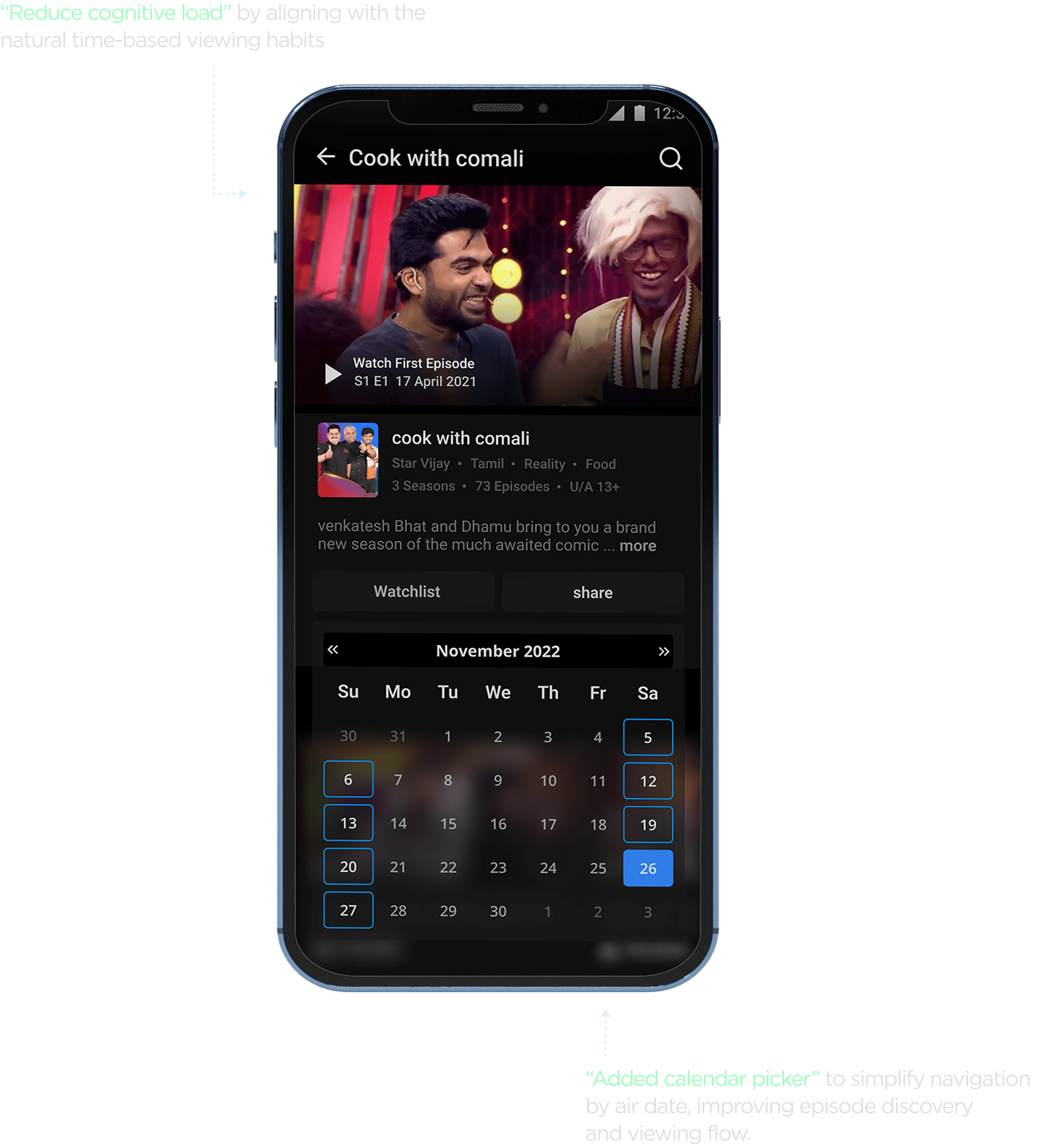
Disney+ Hotstar follows a television-based release model, where content is added after TV telecasts. Many users found it hard to locate episodes in the right order or track air dates.
To address this friction, I incorporated a calendar feature that supports chronological navigation, enhances temporal clarity, and aligns with user expectations. This makes it easier for users to discover, access, and plan their viewing around recent or upcoming episodes.
Video playback Screen
Video playback Screen
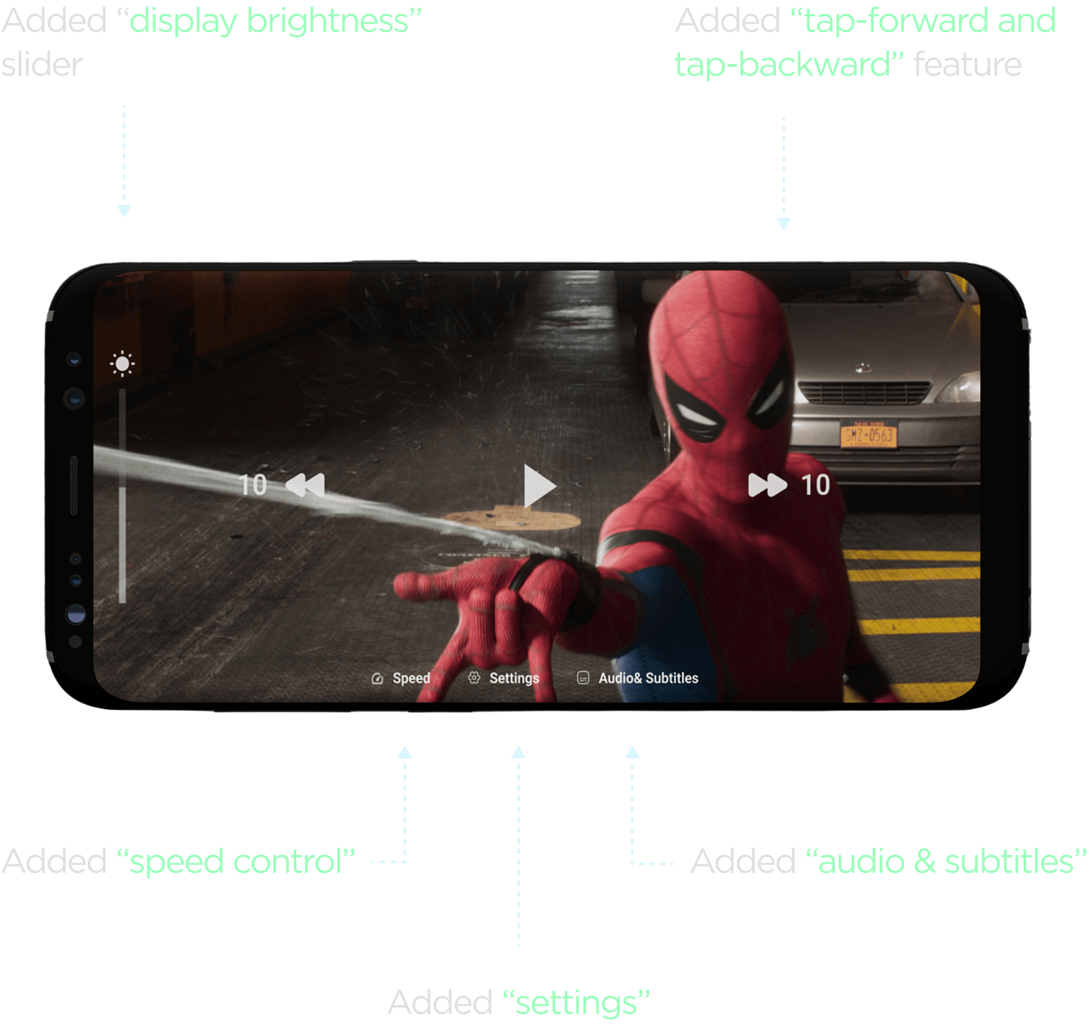
To enhance viewing control on Disney+ Hotstar, key features like brightness slider, speed control, and tap forward/backward were added. These UI improvements support personalized playback and reduce user effort during content interaction.
Additionally, audio and subtitle settings were made easily accessible, and a calendar picker was introduced to match Hotstar’s TV-based release model. This helps users quickly find episodes by air date and improves content discovery through better temporal navigation.
Settings screen
Settings screen

To enhance user experience and streamline interactions, I introduced a unified popup that combines audio language, subtitle selection, and subtitle customization. This improves accessibility, reduces cognitive load, and aligns with in-context control principles allowing users to make quick playback adjustments without disrupting their viewing experience.
From a development perspective, consolidating these settings into a single modular component improves maintainability, reduces redundant API calls, and enables efficient state management—making it both a scalable and user-centric solution.
Prototype
Prototype
A high-fidelity interactive prototype was developed to showcase key UX enhancements. It highlights smoother calendar navigation for chronological content access and intuitive multi-profile selection for a personalized viewing experience.
A high-fidelity interactive prototype was developed to showcase key UX enhancements. It highlights smoother calendar navigation for chronological content access and intuitive multi-profile selection for a personalized viewing experience.
Hey
Let’s Connect
Let’s Connect
If you're looking for a designer who blends
strategic thinking with refined craft, I’d love to hear from you.
If you're looking for a designer who blends
strategic thinking with refined craft, I’d love to hear from you.
" height="32px" id="Q6uNwSobm" width="32px"/></svg>)