Winterbear
Winterbear is a character lifestyle brand and the official destination for BT21 and Line Friends merchandise in India, offering character-inspired apparel, stationery, and home decor.
Context
While using the Winterbear website, I noticed usability issues like unclear navigation, inconsistent hierarchy, and inefficient interactions. To improve the experience, I refined the information architecture, enhanced accessibility, and created a more intuitive, visually cohesive interface for seamless user engagement.
My Role
As a UX/UI designer, I identified usability issues in the Winterbear website, including unclear navigation and inconsistent hierarchy. Through research and redesign, I improved the information architecture, accessibility, and visual coherence, creating a more intuitive and seamless user experience.
01 Identifying The Issues
Home Screen
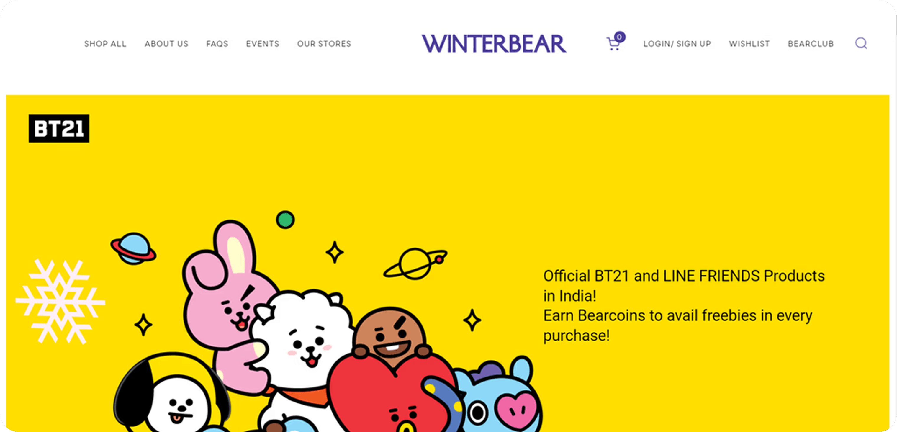

Navigation bar has inconsistent icon styles and alignment issues
The home screen only includes banners showcasing deals and sales,which is a missed opportunity to grab attention on the first page.
Category
Category section is very cluttered and has confusing segments.

Payment
Payment section can be improved with proper navigation for the users.
Cart
Inconsistent spacing and item information could be presented in clear way.
Product Pages
In product screen there is no filters & lack of visual hierrarchy
Lack of spacing between the elements & details were not properly organized
Product details were very clumsy & very long without proper visual hierarchy, so the user has to scroll down more & more it creates heavy cognitive load for the user.
02 Visual styles
Typeface
Inter
Regular
Medium
Bold
Grid System
Column : 12
Gutter : 20
Margin : 100
Icons


Colors
F4FFFD
FFFBE5
78B689
773CA6
FFD400
03 Redesigned screens
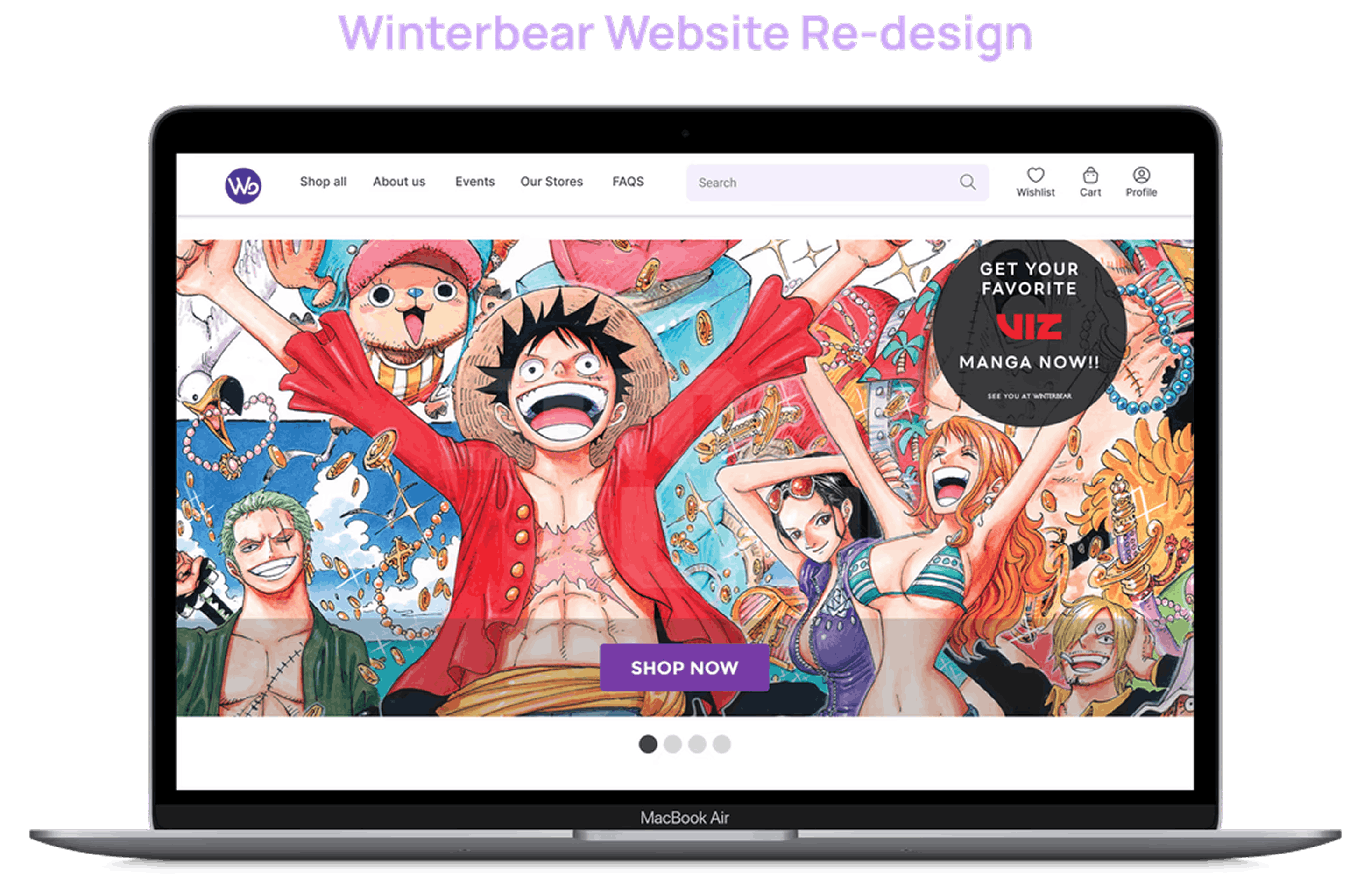
Home Screen
The logo was refined for clarity, a long search bar added for quick access, and wishlist, cart, and profile icons introduced to enhance navigation, hierarchy, and accessibility.
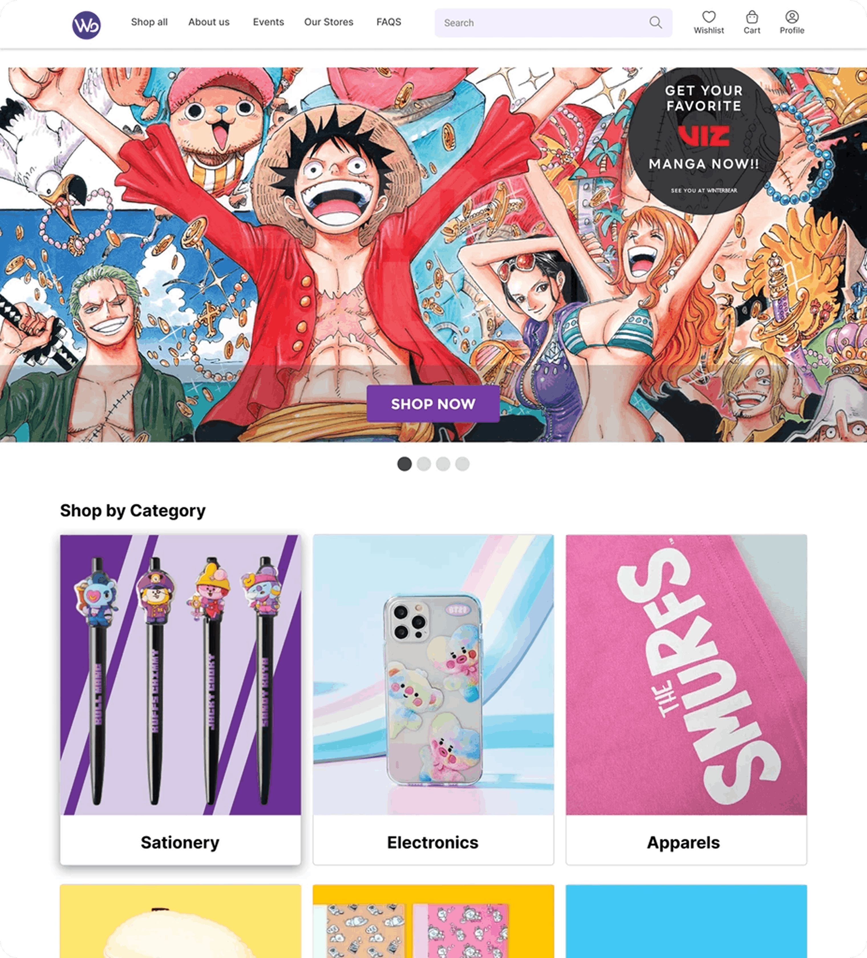
The improved hero section features a prominent "Shop Now" CTA and an overlay screen for strong visual impact, enhancing user focus, experience, and engagement, while the updated carousel with bottom-positioned font improves readability, visual hierarchy, and conversions.
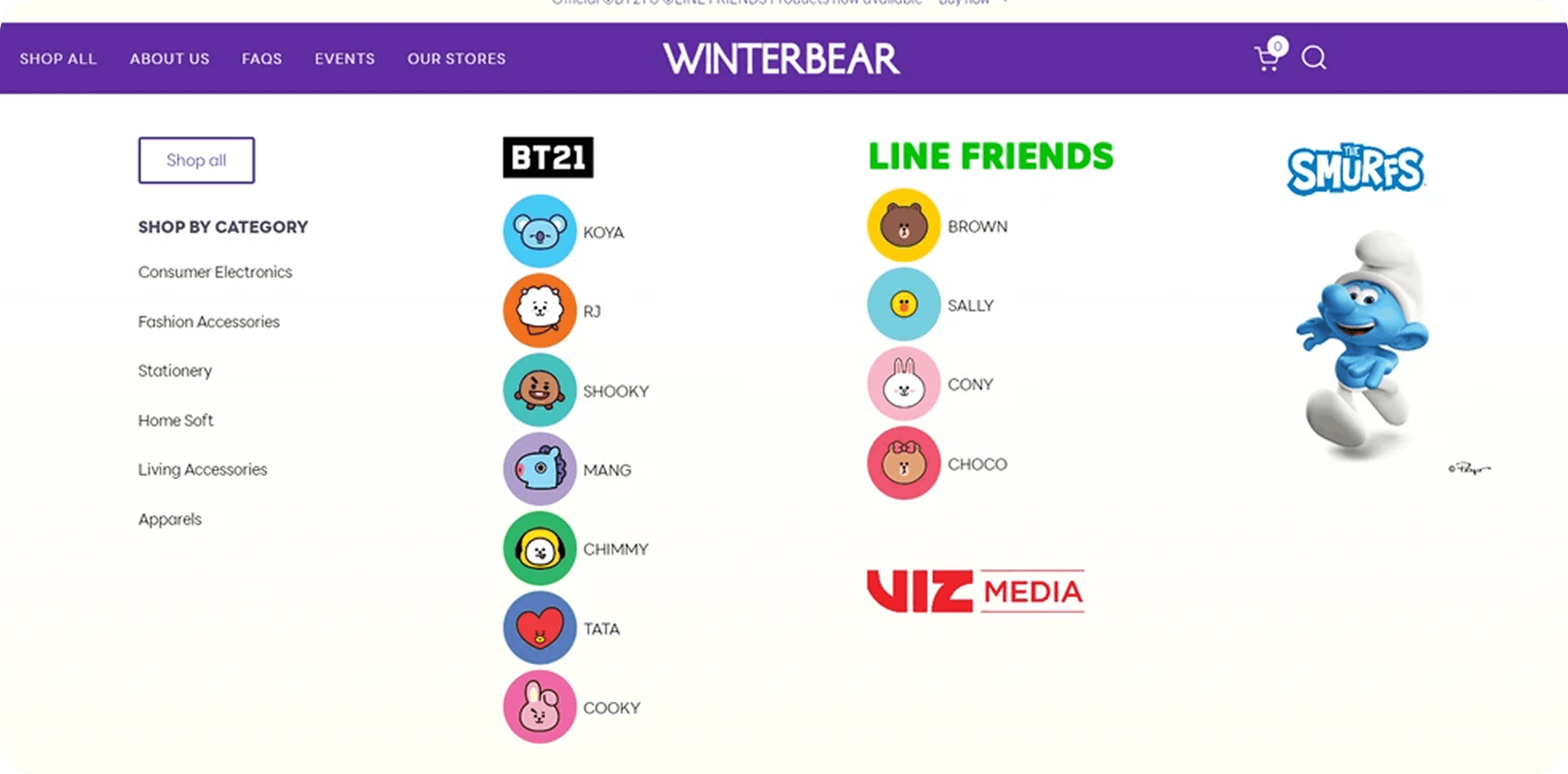
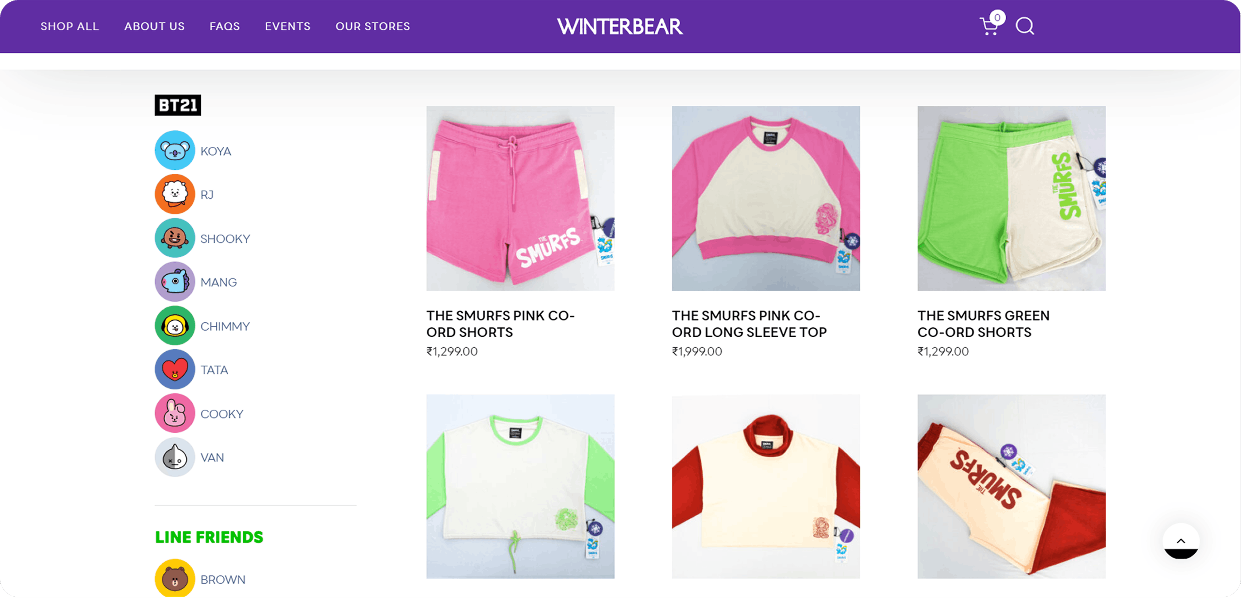
Category
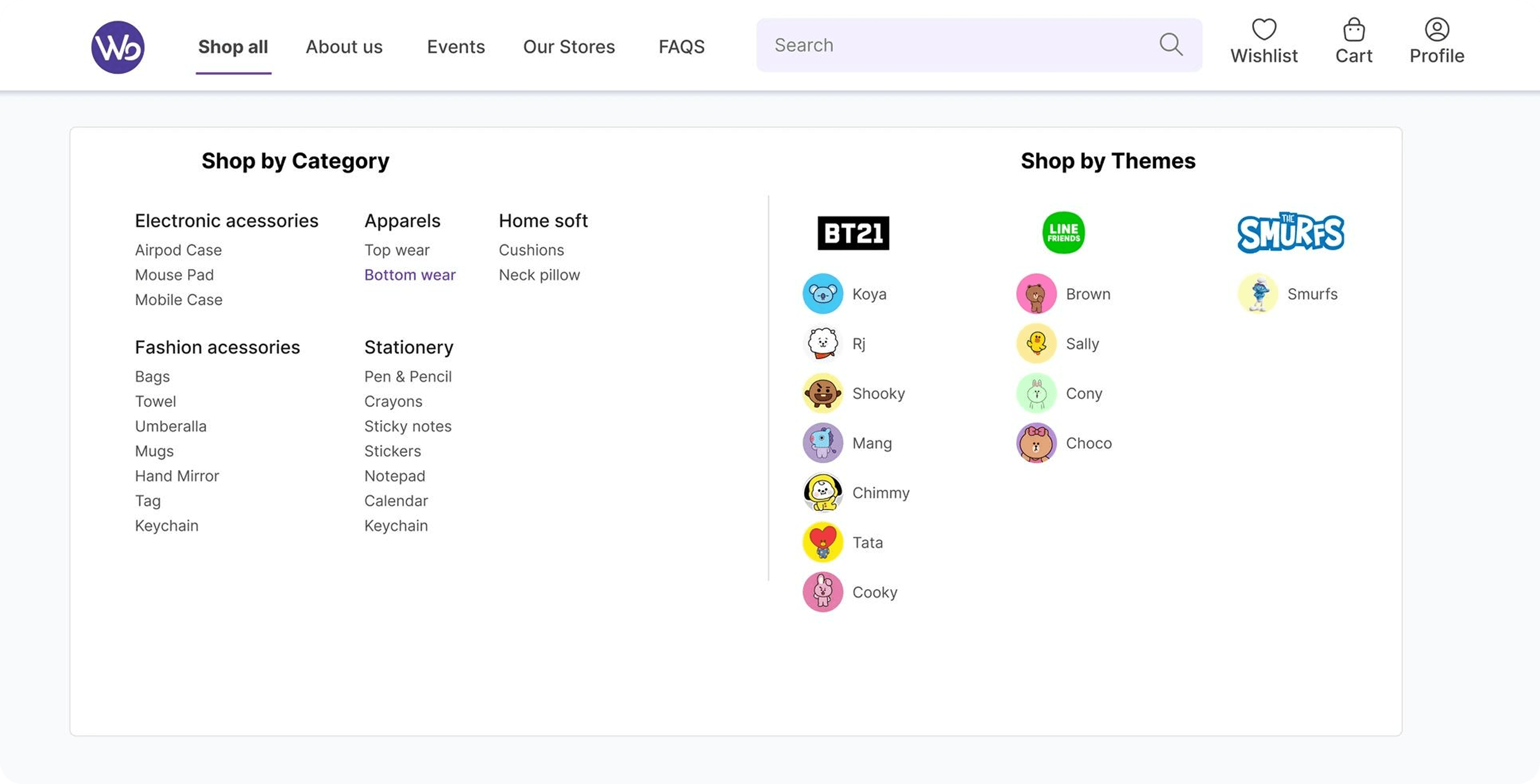
I applied the Von Restorff Effect by adding underline and font size changes to navigation titles for better visual distinction. The category section was redesigned with "Shop by Category" and "Shop by Themes" segmentation to reduce cognitive load and improve discoverability.
Product Page
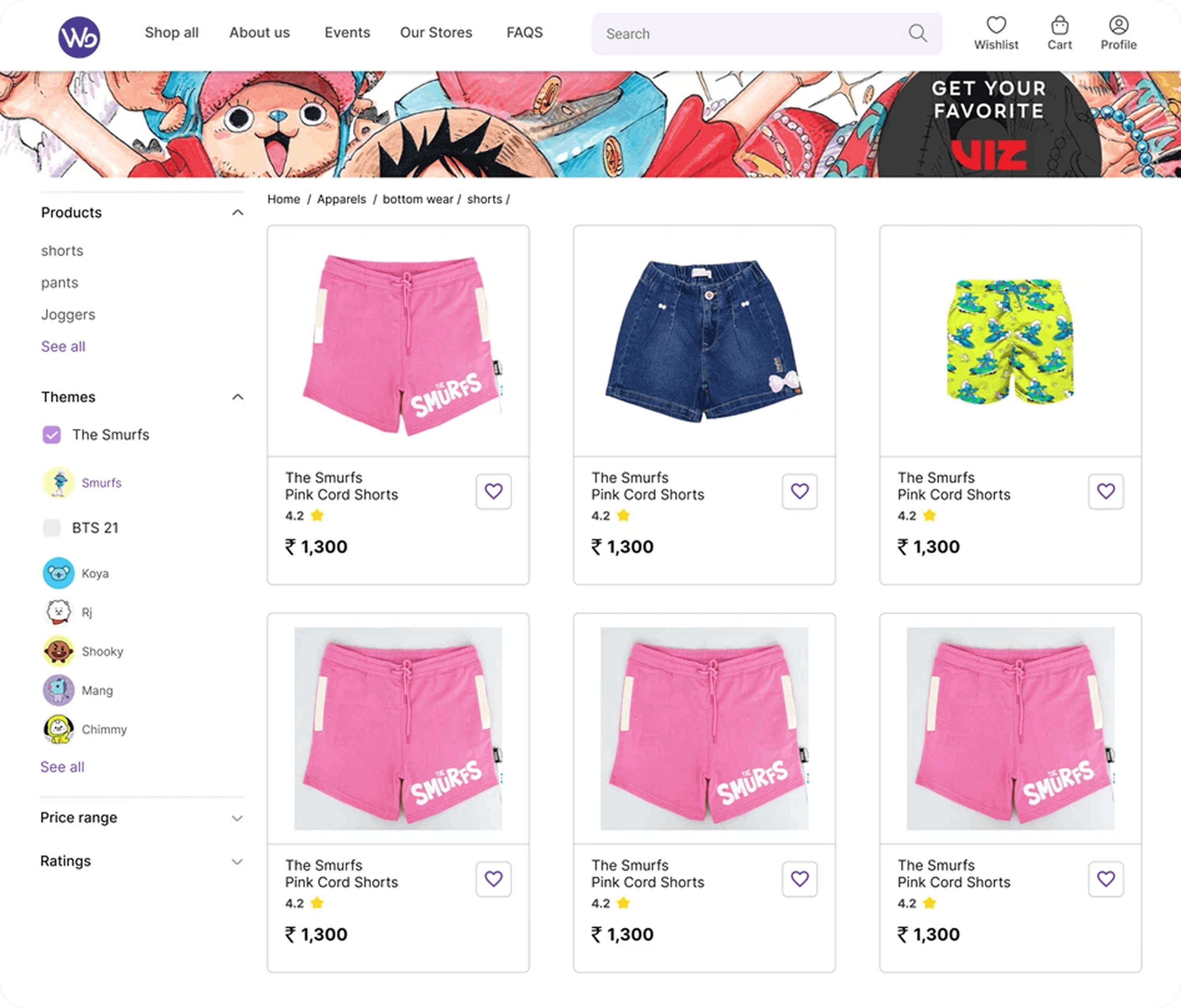
I added a refined filter section with enhanced typography and color contrast for better visual appeal and usability, reducing friction and ensuring a seamless user flow for essential interactions.
Product Detail Page
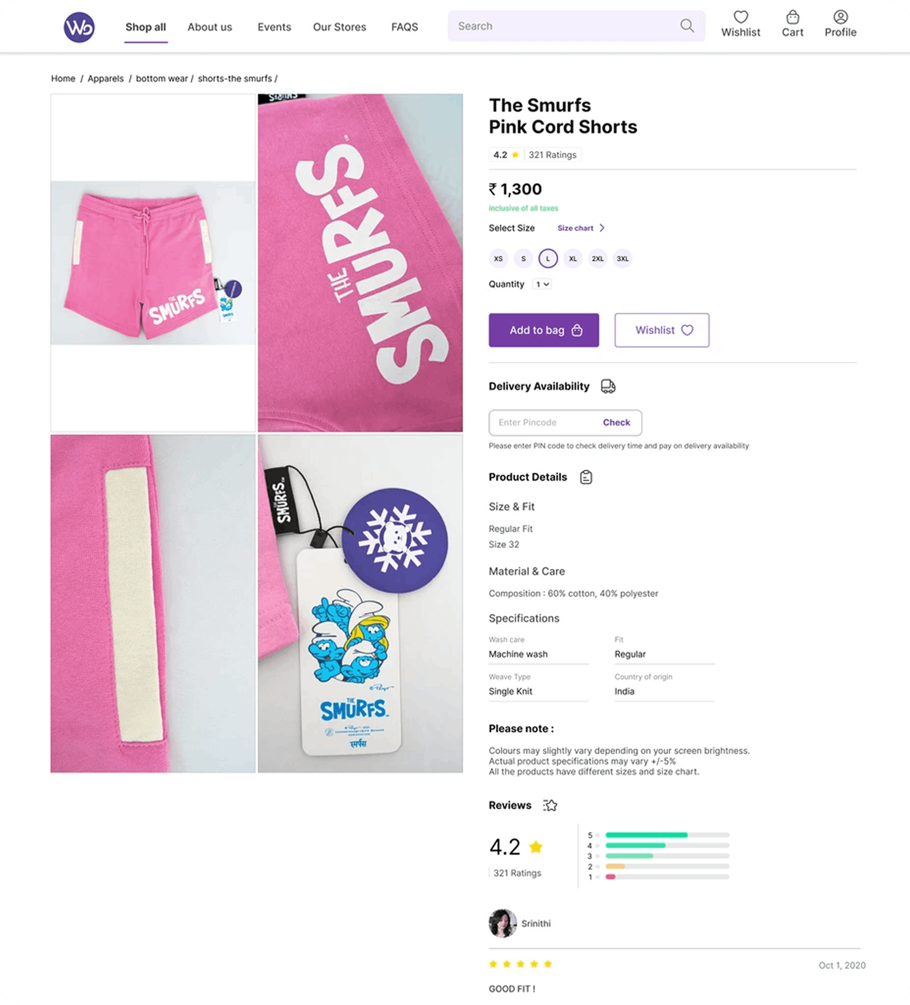
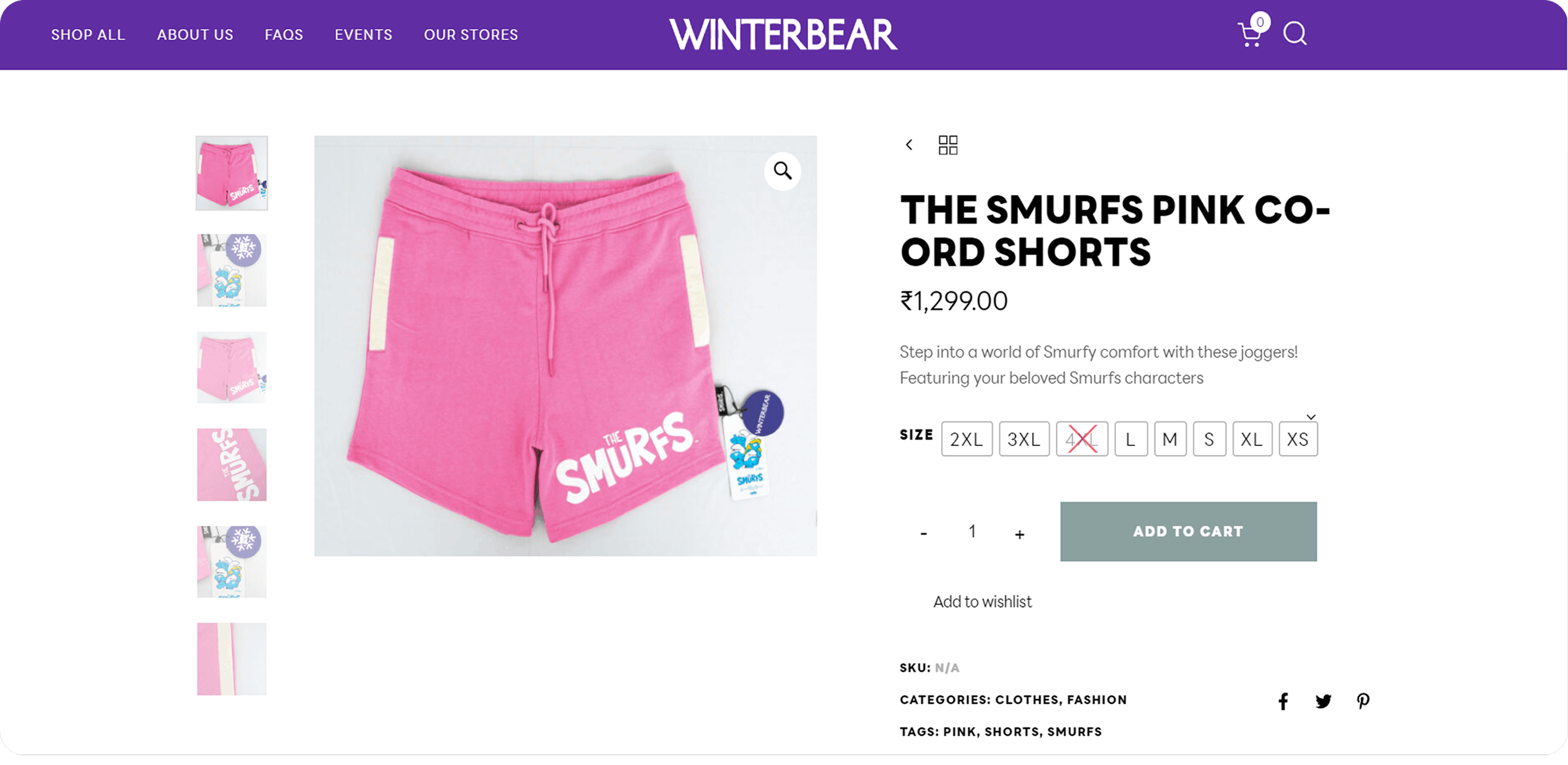
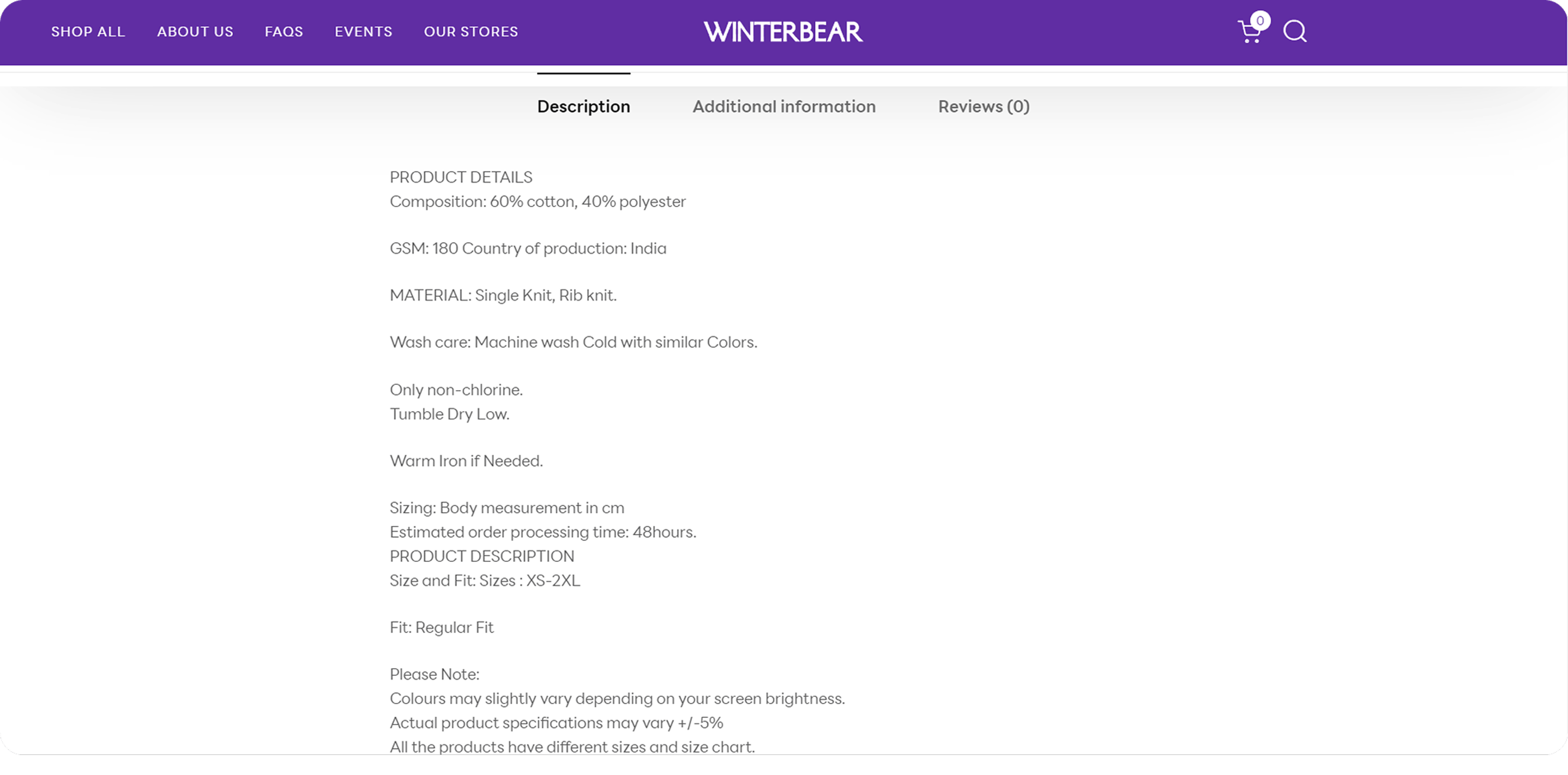
A large product carousel improves visual engagement and decision efficiency, with a tabular layout optimizing content readability.
The product view section was redesigned using Jakob’s Law, aligning with familiar mental models for a more seamless user experience. Actionable buttons like "Add to Bag" and "Wishlist" enhance usability, while icon- based navigation reduces cognitive load.
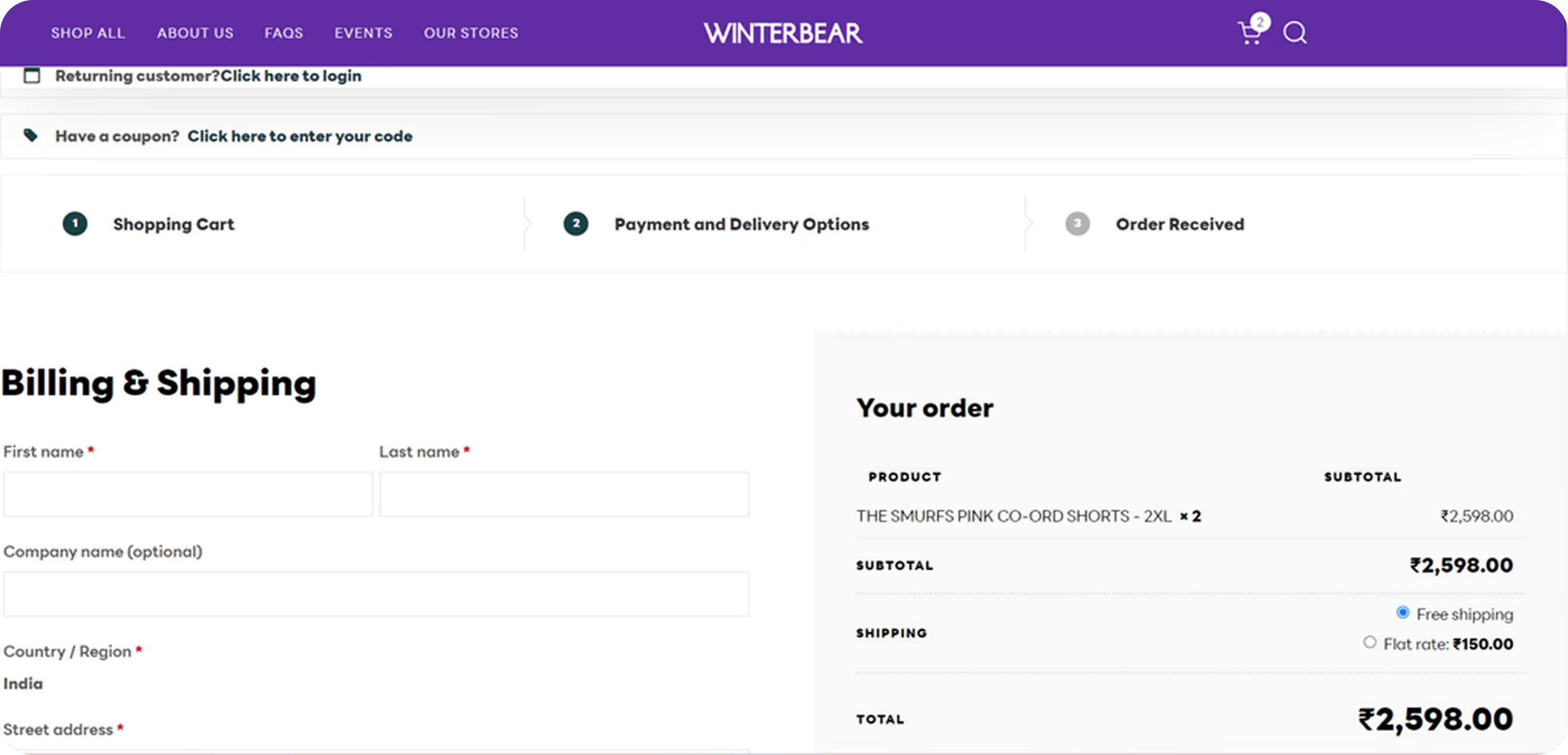
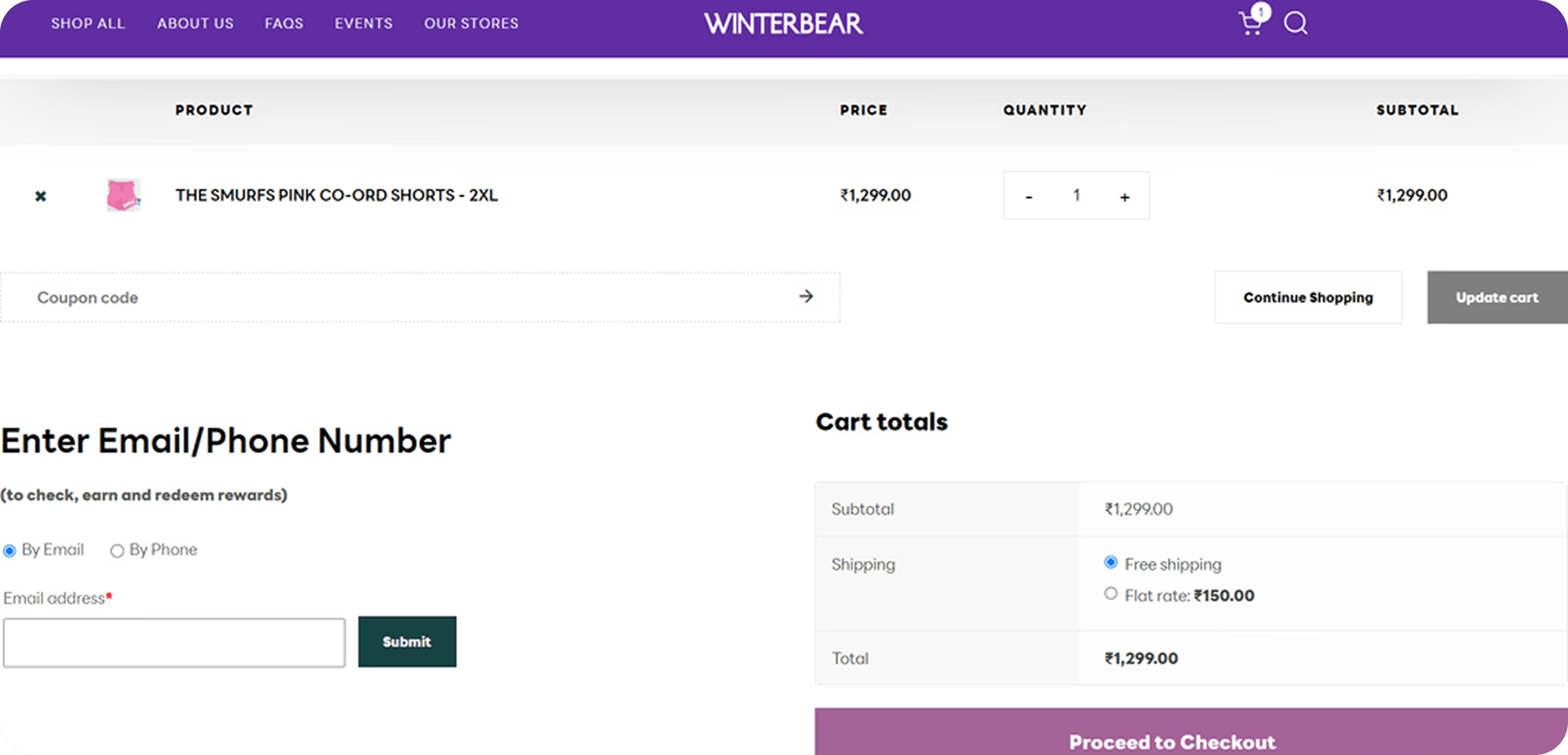
Cart
I have optimized the payment flow by separating address and payment steps for better usability. The billing section now has an improved visual hierarchy, and a “Proceed to Shipping” CTA ensures a clear next step, ensuring a seamless user flow.
Shipping
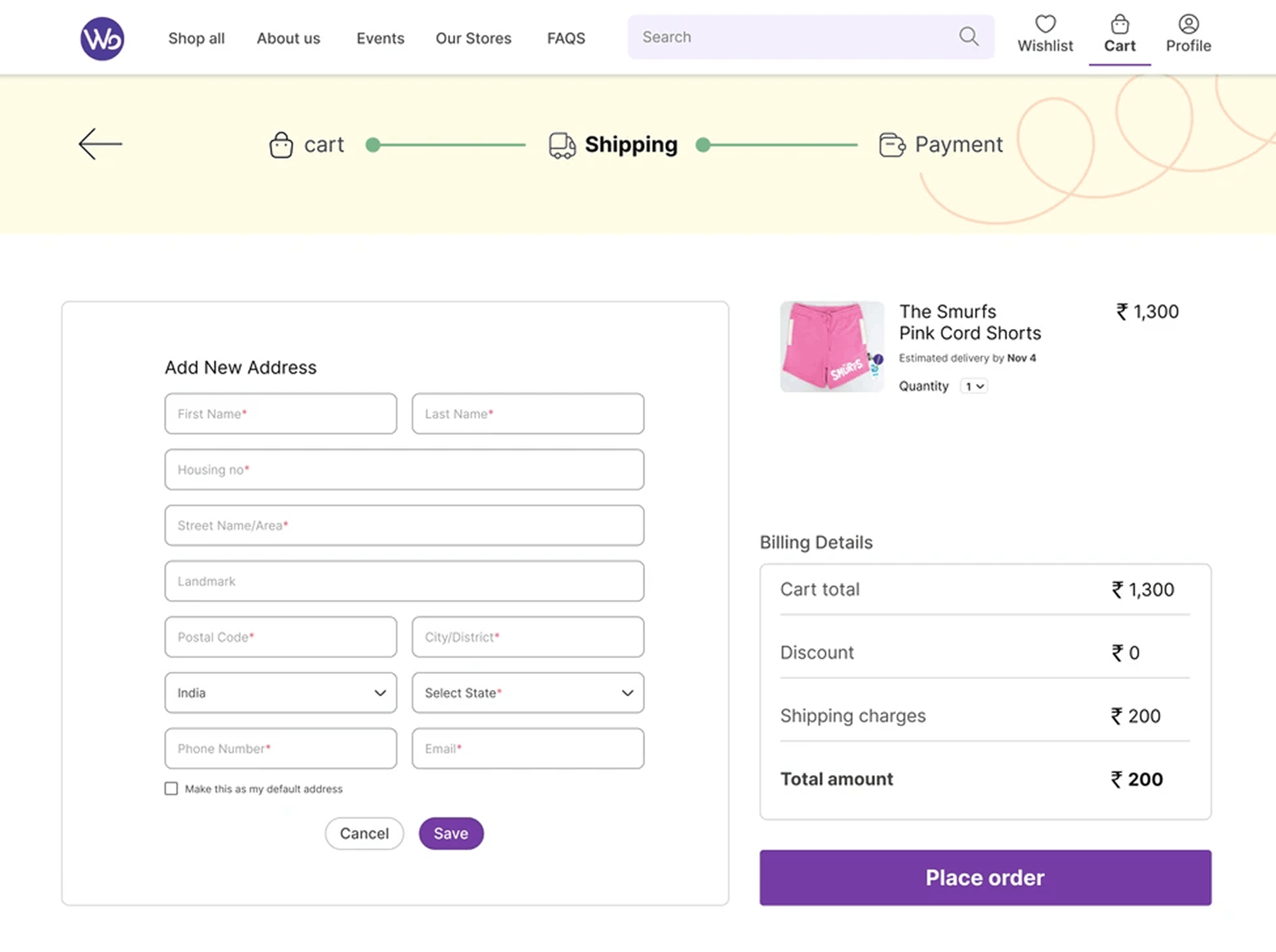
I have improved the address section with a save option for seamless entry and retrieval. A compact product carousel ensures quick visual confirmation, minimizing selection errors and enhancing user accuracy.
Payment
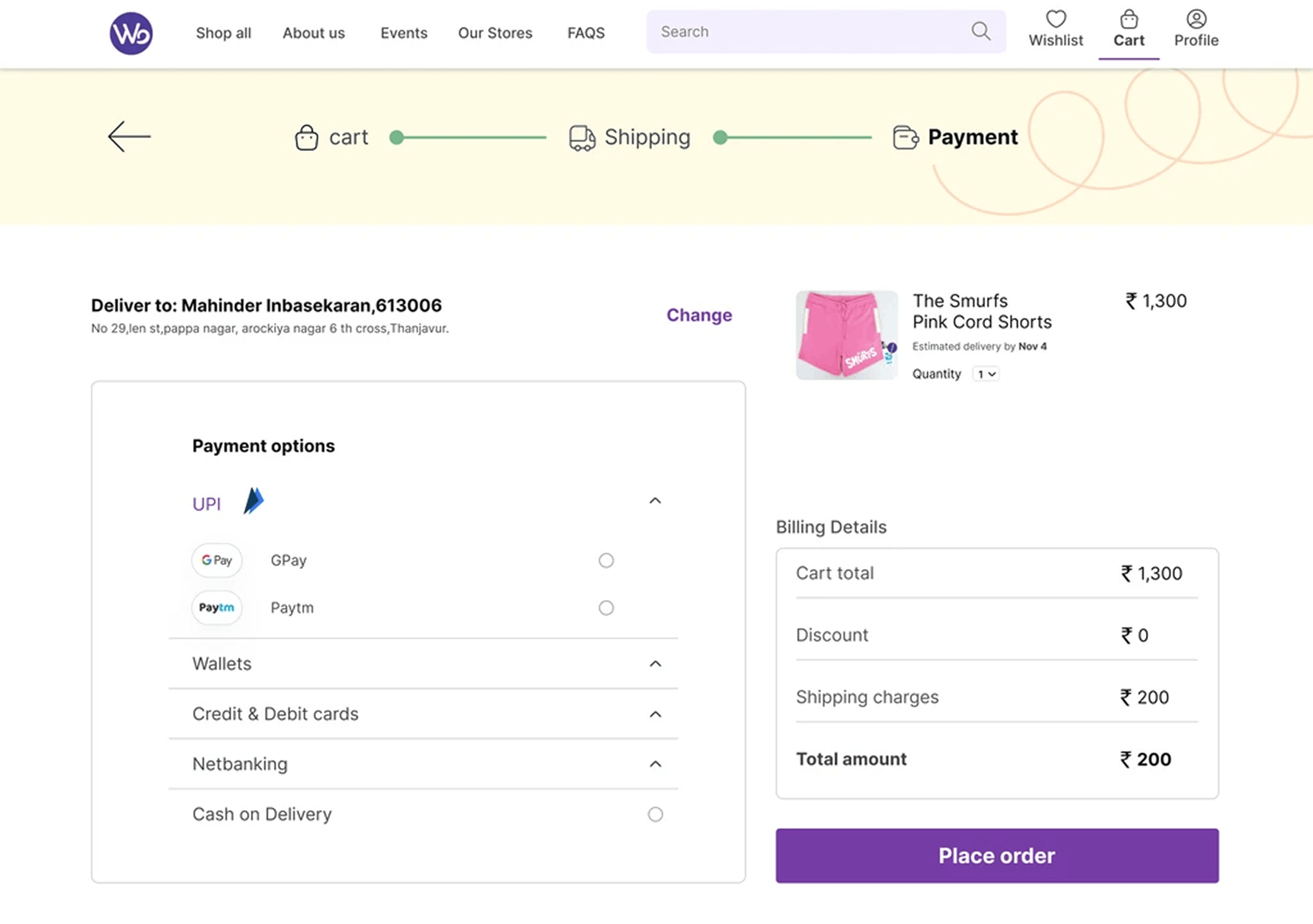
I have refined the payment flow with multiple options—UPI, cards, net banking, and COD—using logos and vertical radio buttons for quick selection and clarity. The address section now includes a clear indicator and a “Change Address” option, leveraging confirmation bias for better decision-making.